I just have to share these amazing interior renders by Bertrand Benoit - easily two of the best interiors I have seen. Click through to flickr to see them bigger and for the rest of the series.
Ronen Bekerman's Hover Challenge
In case you haven't seen it, Ronen has wrapped up the latest arch viz challenge on his site, Hover. I really enjoyed following everyone's progress, and just wanted to share my favourites here (along with some commentary on each!).
My personal favourite entry was Tolgahan Güngör's imaginative interpretation of the brief. I know this wasn't his final entry but they were all very good. I loved the design, composition and lighting. There were maybe some technical things that could have been better, but for me they aren't so important when the overall mood is right.
Next up is Micael Dillner's entry. A strong concept, the environment here really appealed to me, and I liked the composition a lot too (I know the judges disagree with me here!).
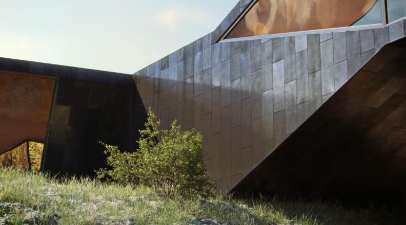
Finally Benjamin Brosdau's sleek modern house. It was fascinating following the development on his thread, if you haven't looked through it you really should. Great attention to detail, incredible modeling and texturing, there's lots to learn there for everyone. Considering the promise shown though, I felt the final 2 images needed a bit more work in terms of lighting and composition. The final exterior shown here seems to be a bit in between an exciting dynamic view and a stiffer straight on view (like Micael's above). I'd like to have seen some more experimentation in composition and lighting before settling on the final entries. Here is an example of the stunning attention to detail shown on Benjamin's WIP thread:
Congratulations to everyone who took part, and well done Ronen for another great challenge!
The Third & The Seventh
If you haven't seen it already, make sure you check out Alex Roman's short film The Third & The Seventh. Truly inspirational, and an incredible piece of work by just one person. His passion for architecture and photography shines through.


