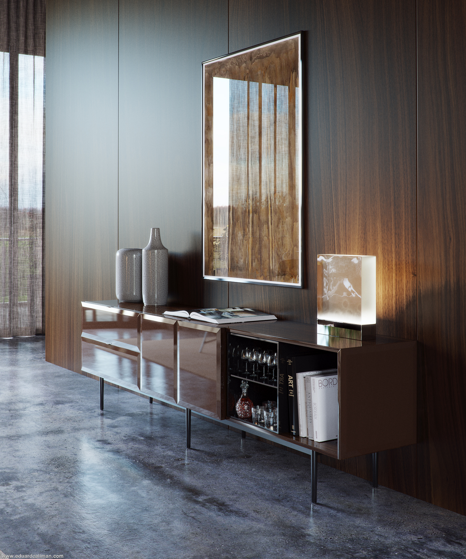
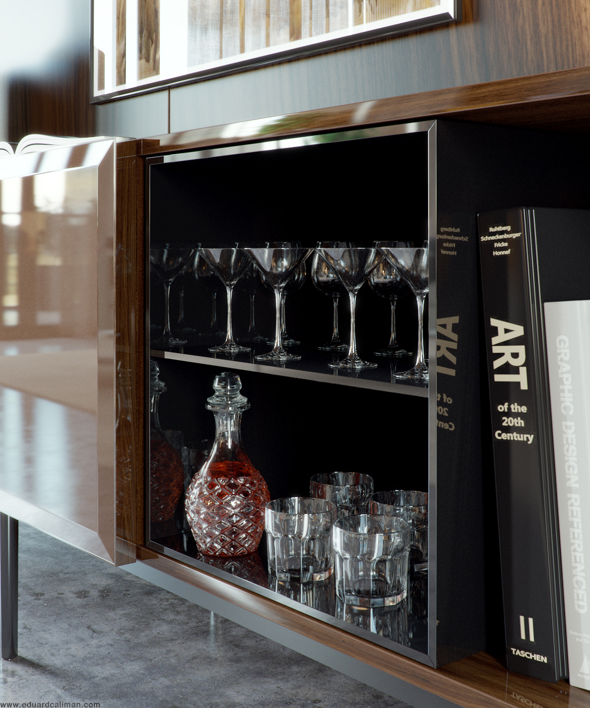
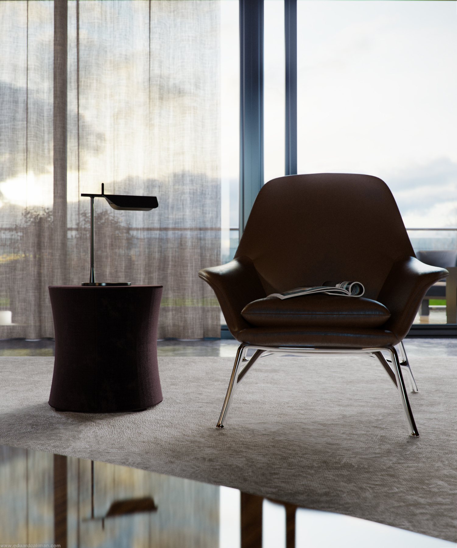
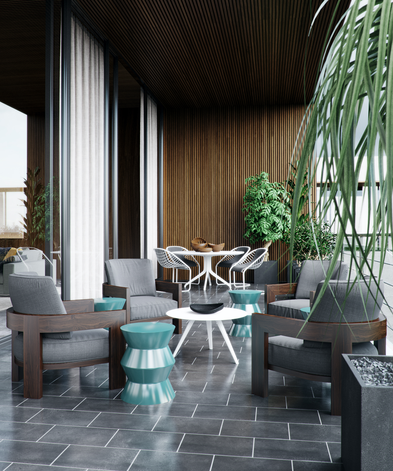
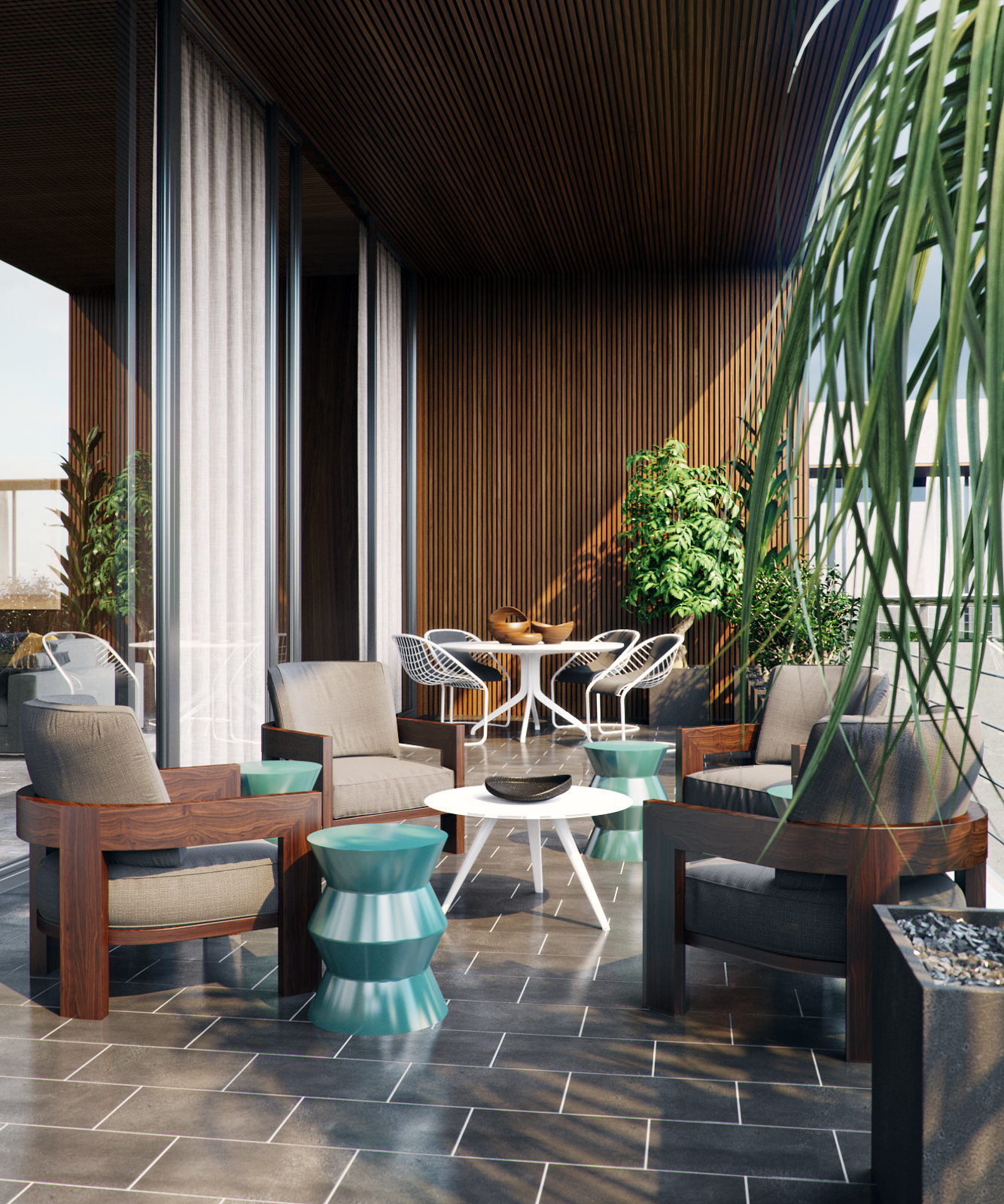
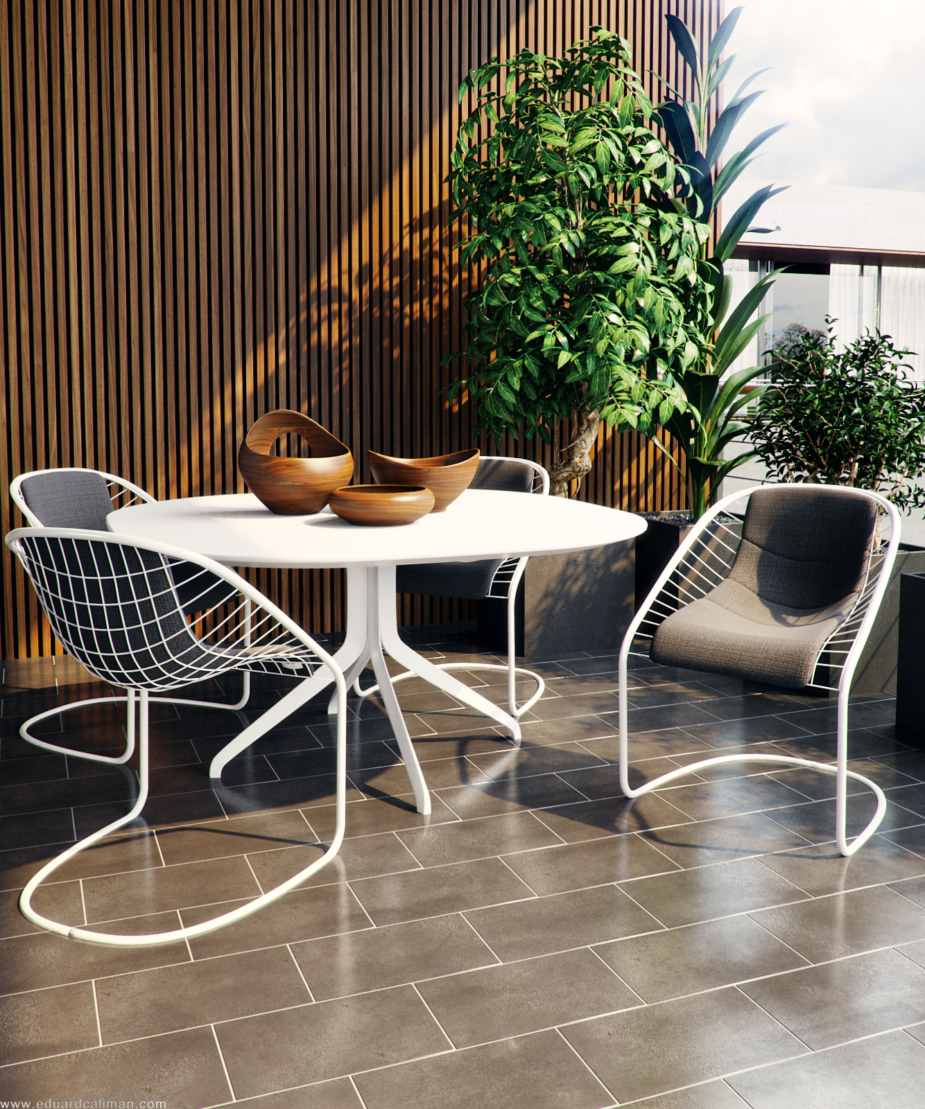
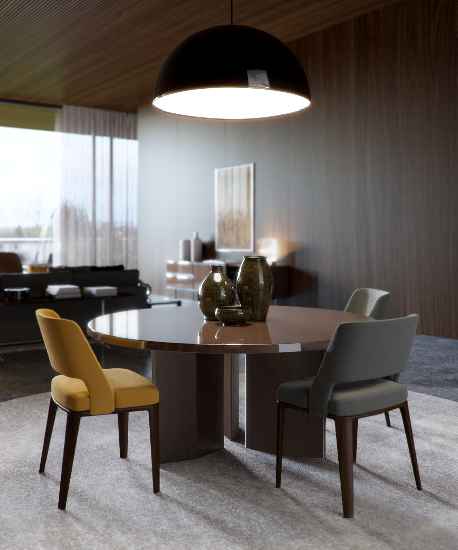
These renders by Eduard Caliman caught my eye recently. A very sophisticated look which is hard to pull off. Great lighting and materials and all done in Corona Renderer which makes it extra interesting for me.
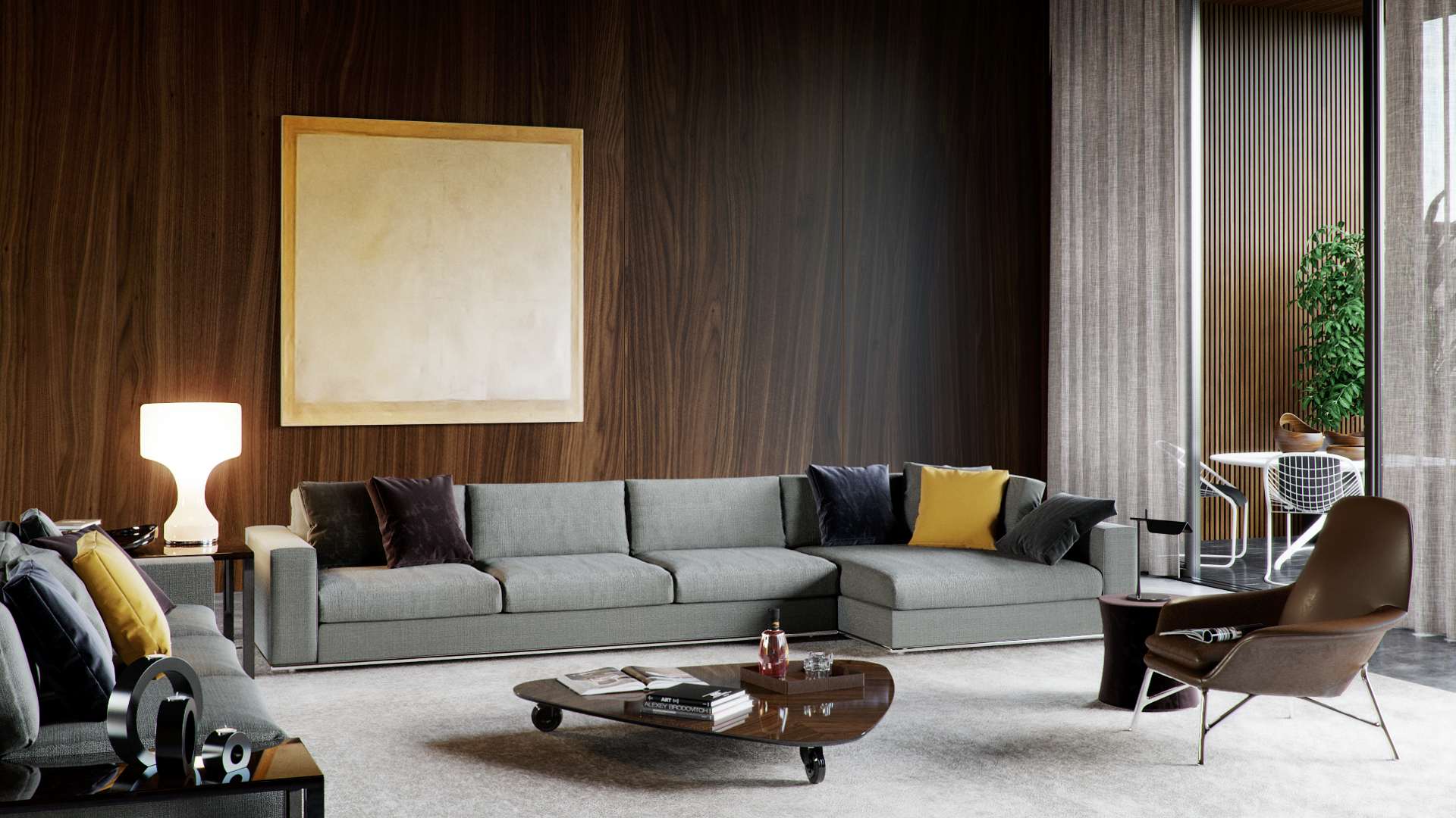
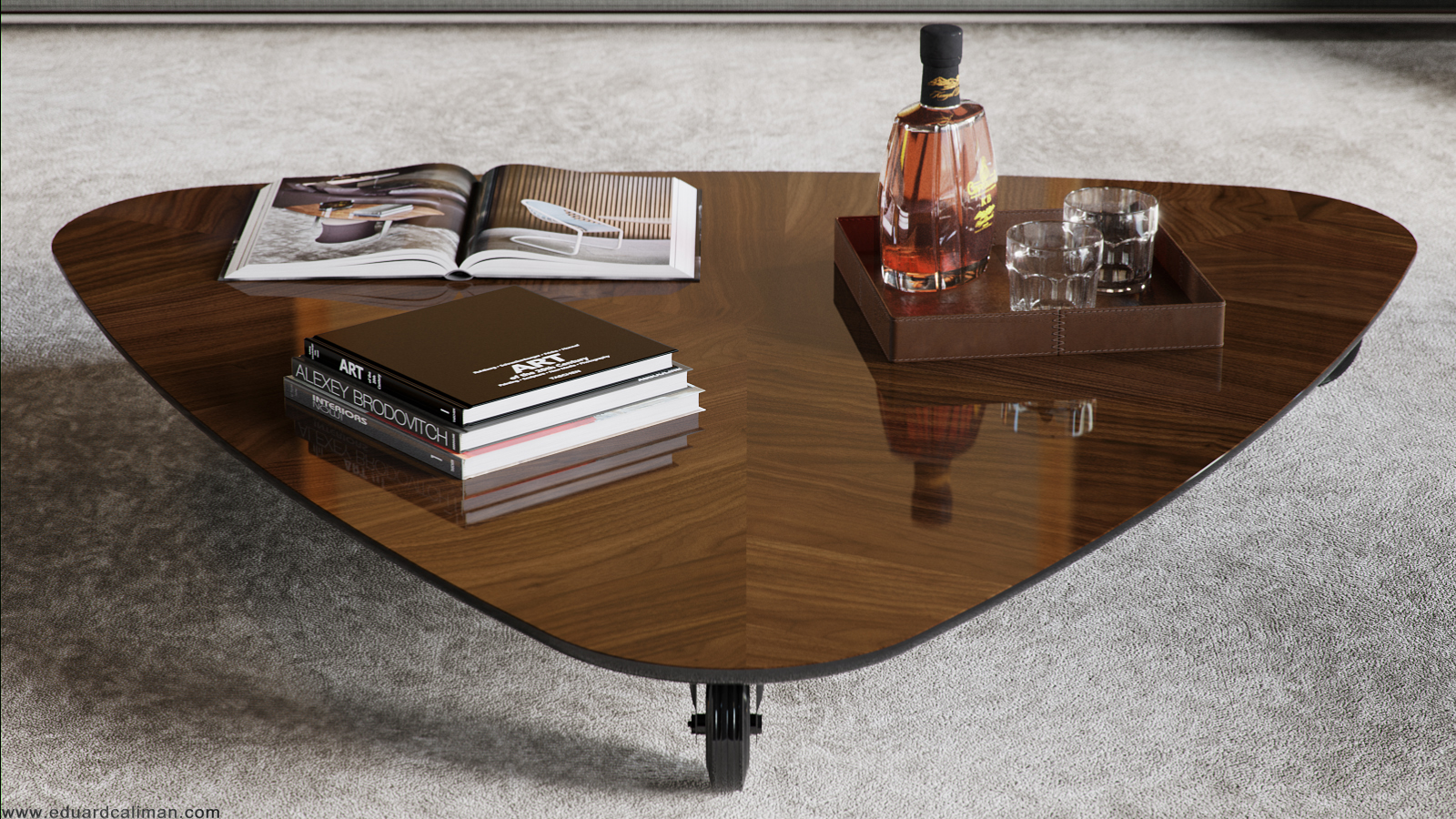
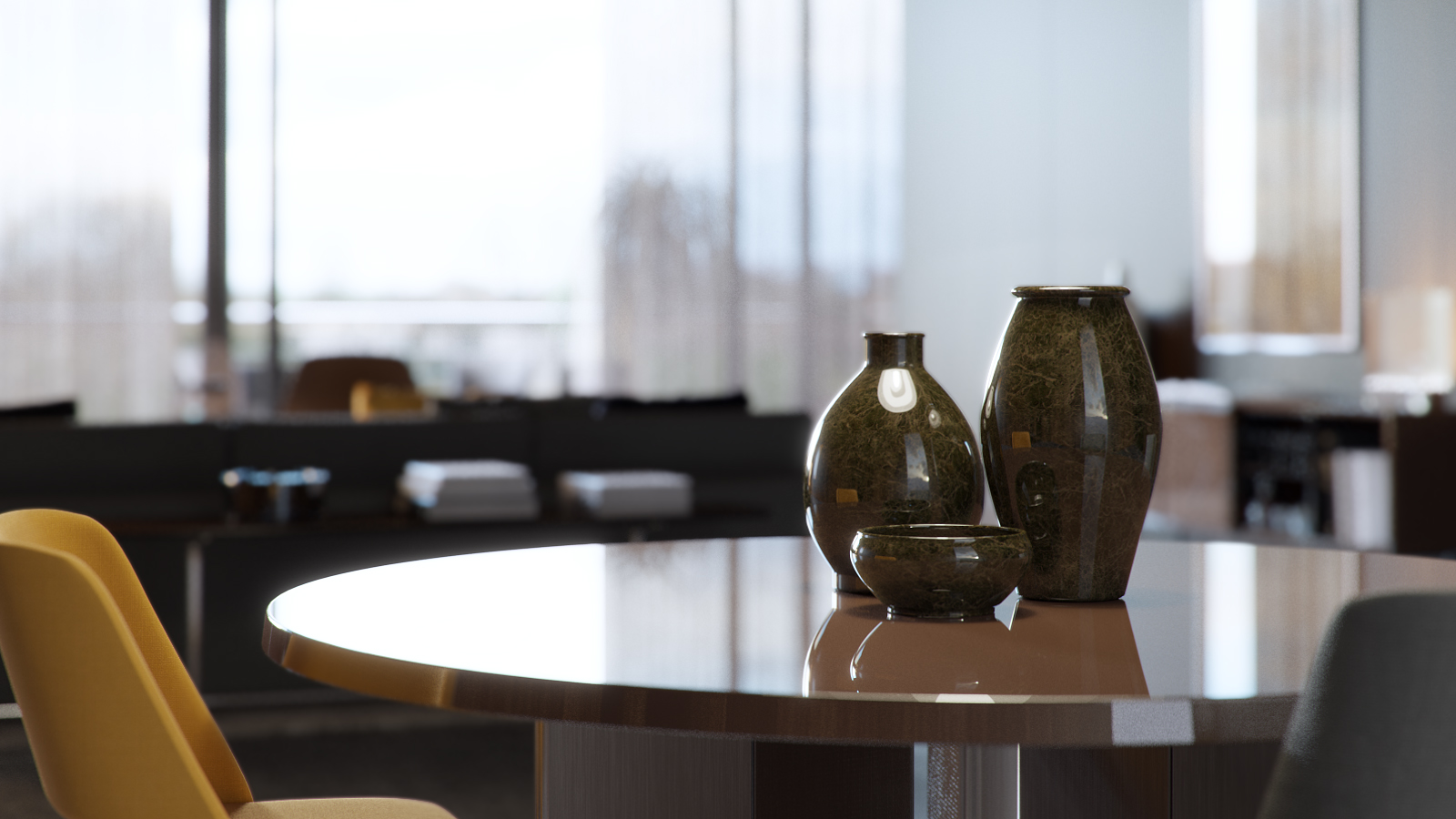
Here are a few notes from Eduard on how he did it:
After I had decided upon and set up the initial space I added temporary placeholders which allowed me to have a bit of detail when testing the lighting. I always like to have visibly some nice results when doing tests, that way I am compelled and inspired to keep on going with the project and also that is why I usually take care of the lighting and materials at an early stage.
Lighting
I knew from the get go that I wanted an overcast feel to the interior, and that is why I chose one of Peter Guthrie's great set of HDRIs. For this particular project I chose the 1313 Cloudy HDRI which worked out perfectly, I only fiddled a bit with the rotation of it just to get the shadows as I wanted them to be but as far as illumination quality it was ideal.
For the sunny balcony shots since you don't see too much the sky I kept the same HDRI but added a corona sun and that was it.
he material creation process was quite simple actually and not a lot of complex shaders were created. will say a few words though on the cushion, concrete and rug materials.
Cushion material
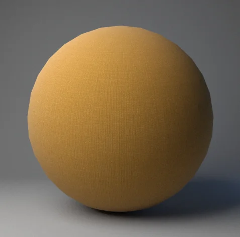
What is more interesting about this shader is the way I used the fallof map. Whenever I create a fabric material I usually do it this way: I plug in the base map in a composite layer, and I duplicate that slot. I will then colour correct the second slot and modify the gamma of that map, I usually raise it to 2/3 depending on the map. This will give me a darker map and a brighter map, I then add a fallof map in the mask of the brighter slot. Now, usually a fabric material has some imperfections on its fallof which is never perfectly shown; that is why I add a map on top of the fallof to show or hide some of the fallof effect, in the screenshot I will post below you can see that I have used that particular map in screen mode (3% opacity) to do just that, to use the brighter values of the map to add some brighter spots on other areas of the fabric. Some other times I also use the bump map in multiply mode to remove some of the fallof effect.
Concrete material
To get to the bump map of a texture what I usually do is desaturate the image and then apply a Levels correction similar to the one below. Note how the sliders are placed at the beggining, middle and end of the colour information inside the histogram, that way one creates a texture that is easy to manipulate in 3DS Max using the various blending modes in the Composite map (usually Multiply and/or Screen in my case) as you will see below. A good advice would be not to go over the information in the histogram too much so that you don't clip and lose valuable colour information.
Rug material
A very simple one, the prerequisite here was to have good enough maps. The settings were very simple, bump at 1 and that's it.

