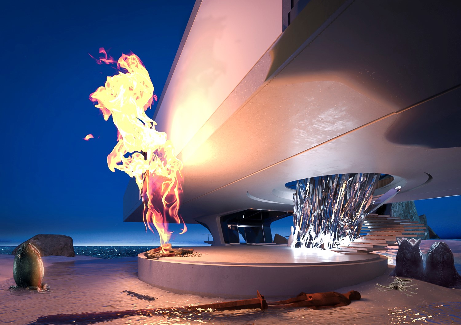
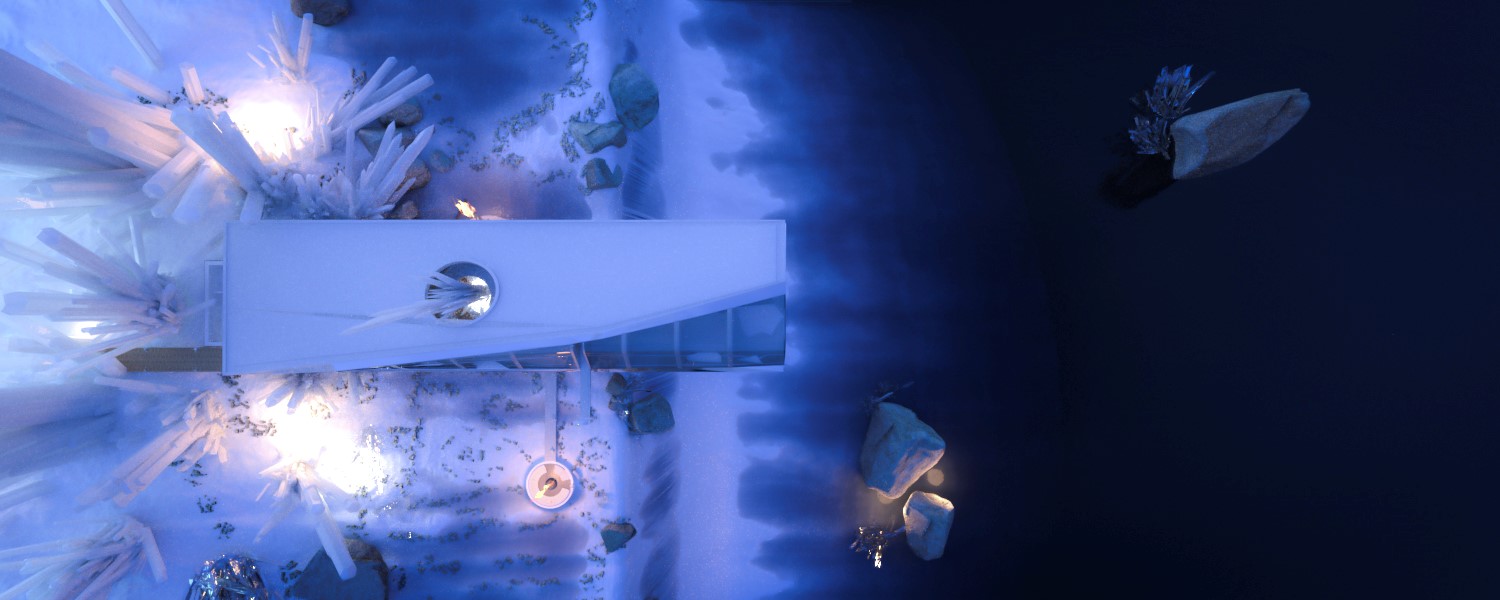
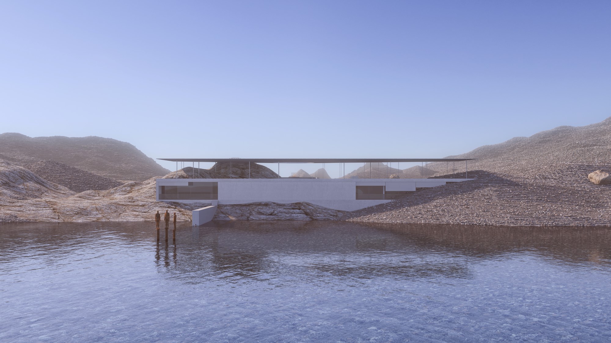
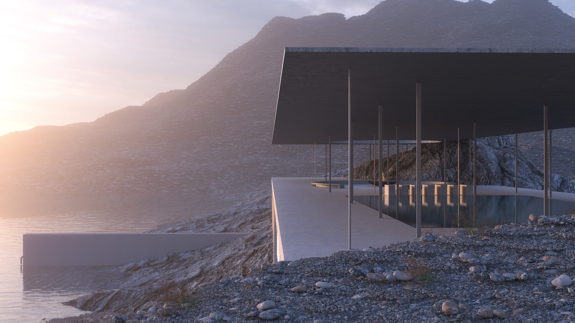
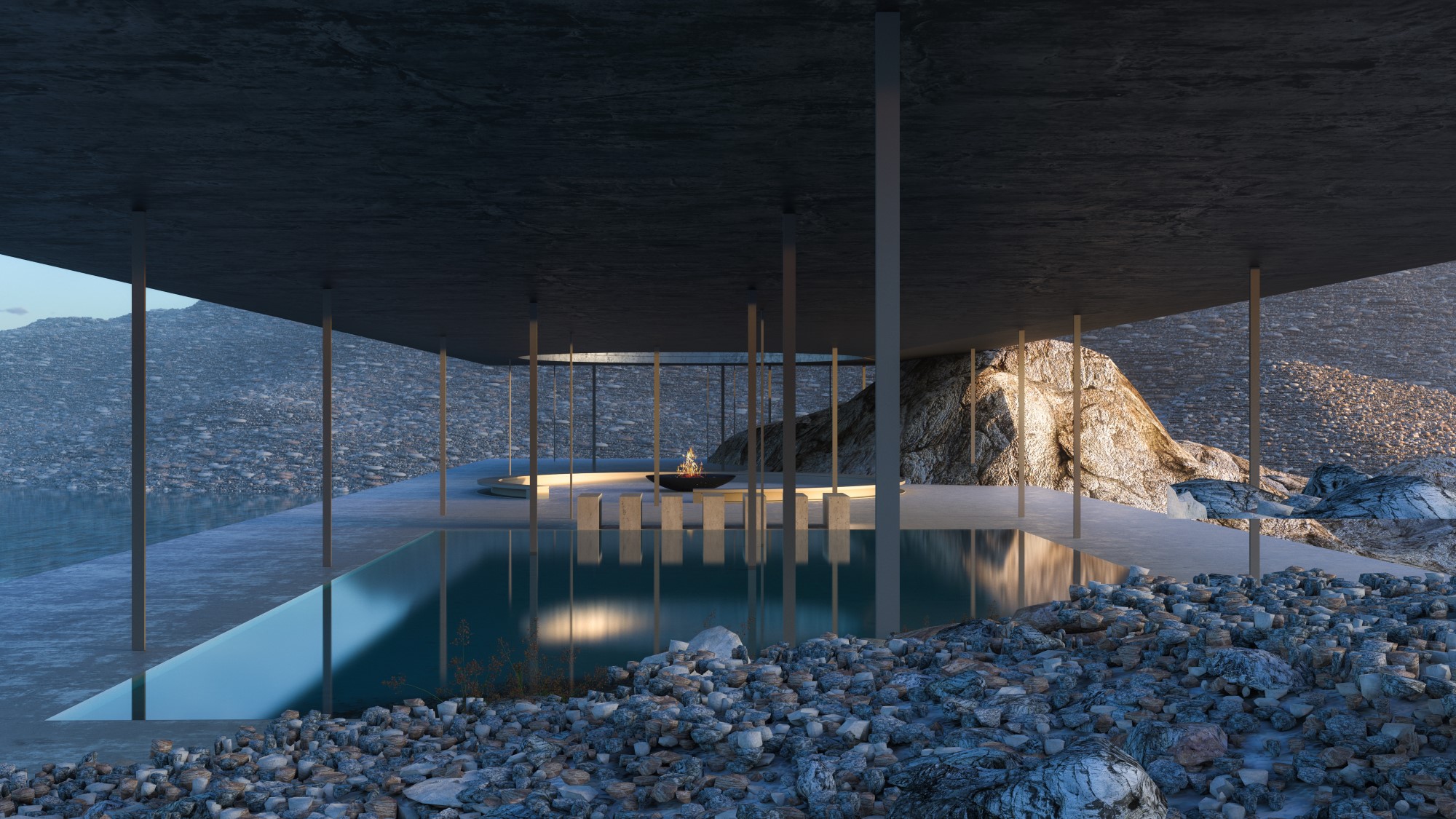
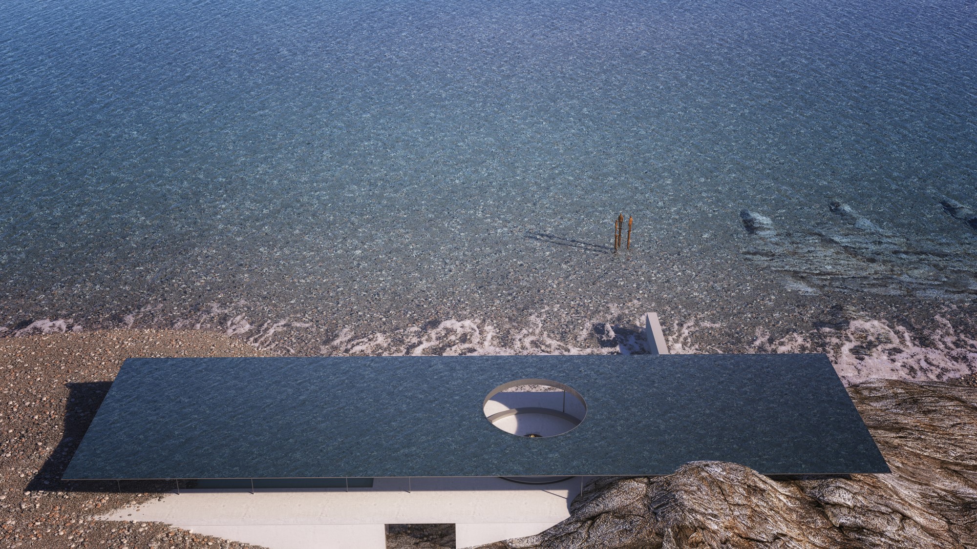
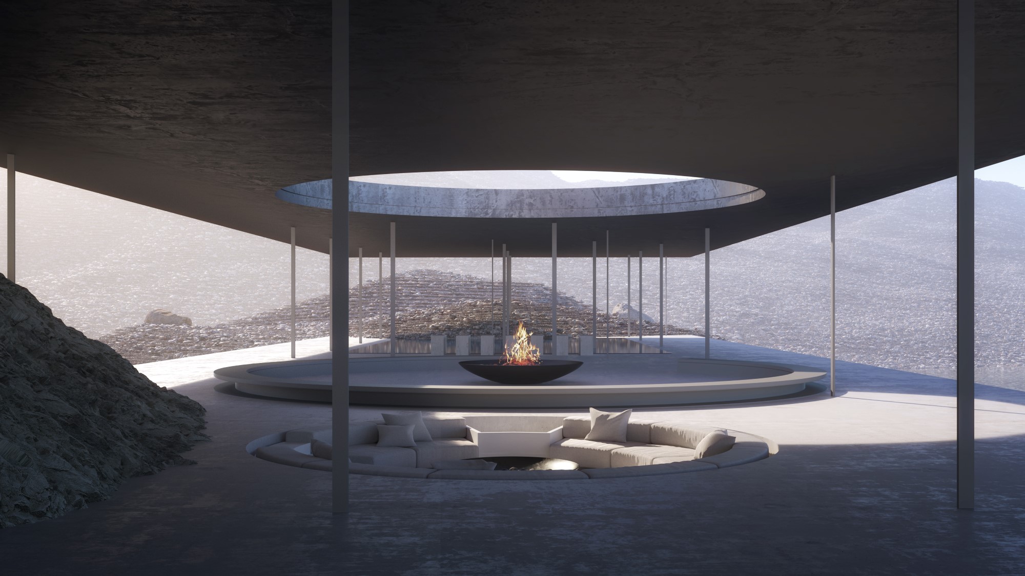
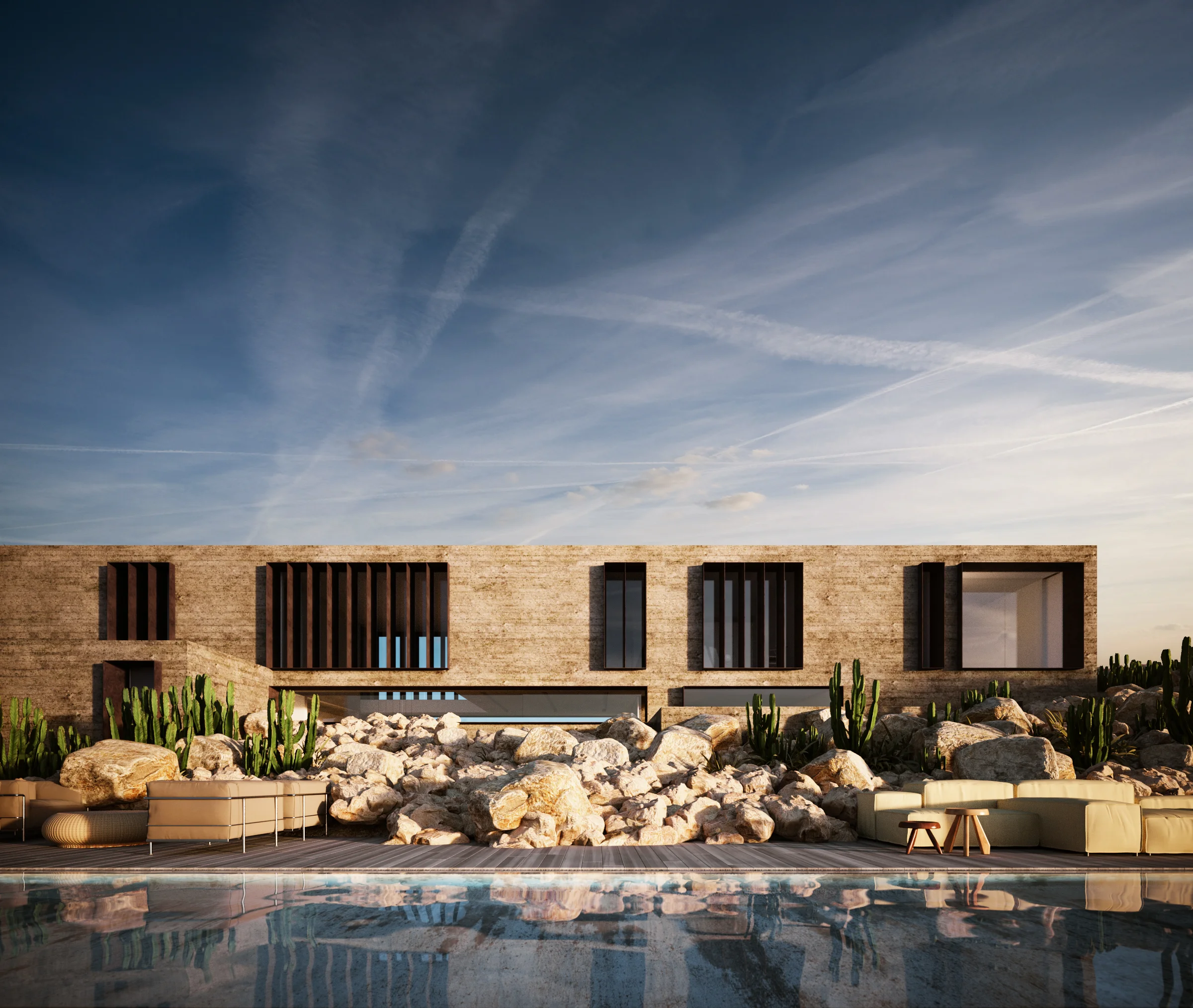
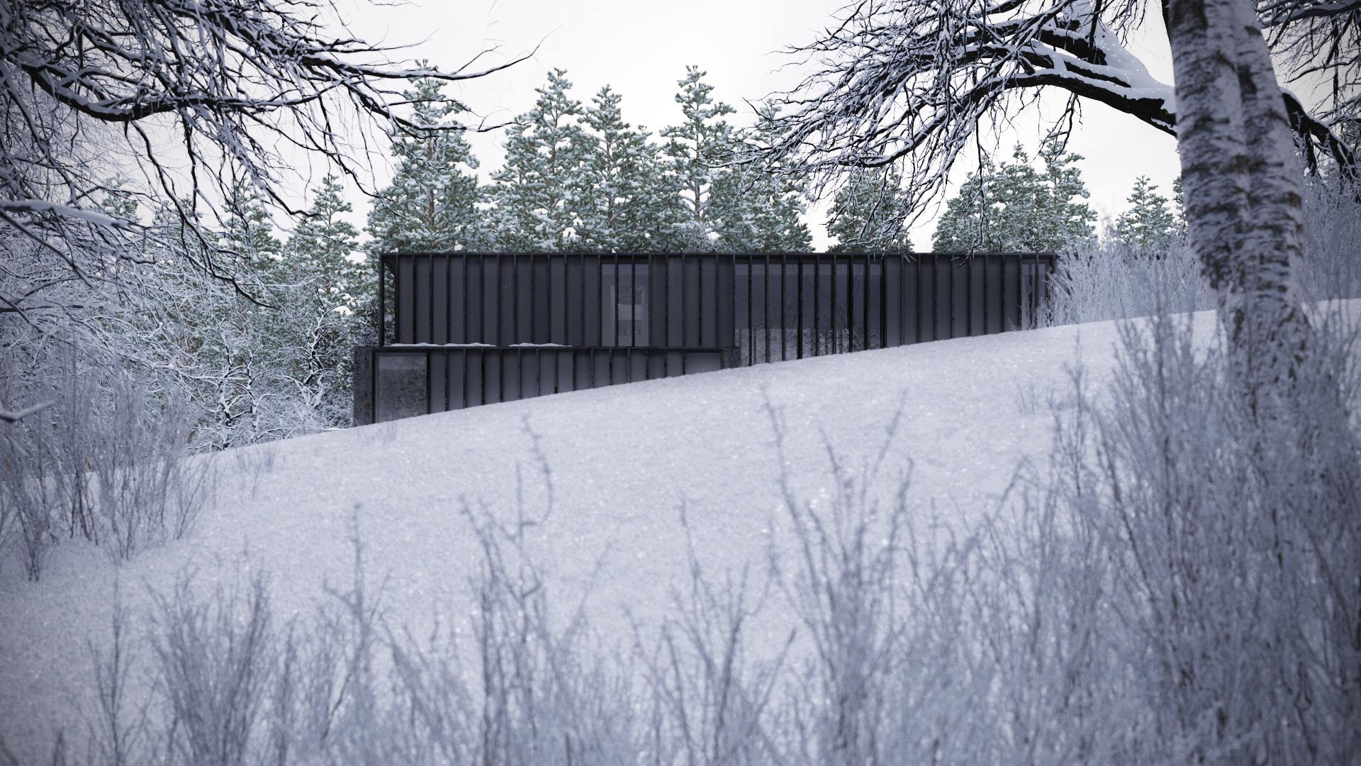
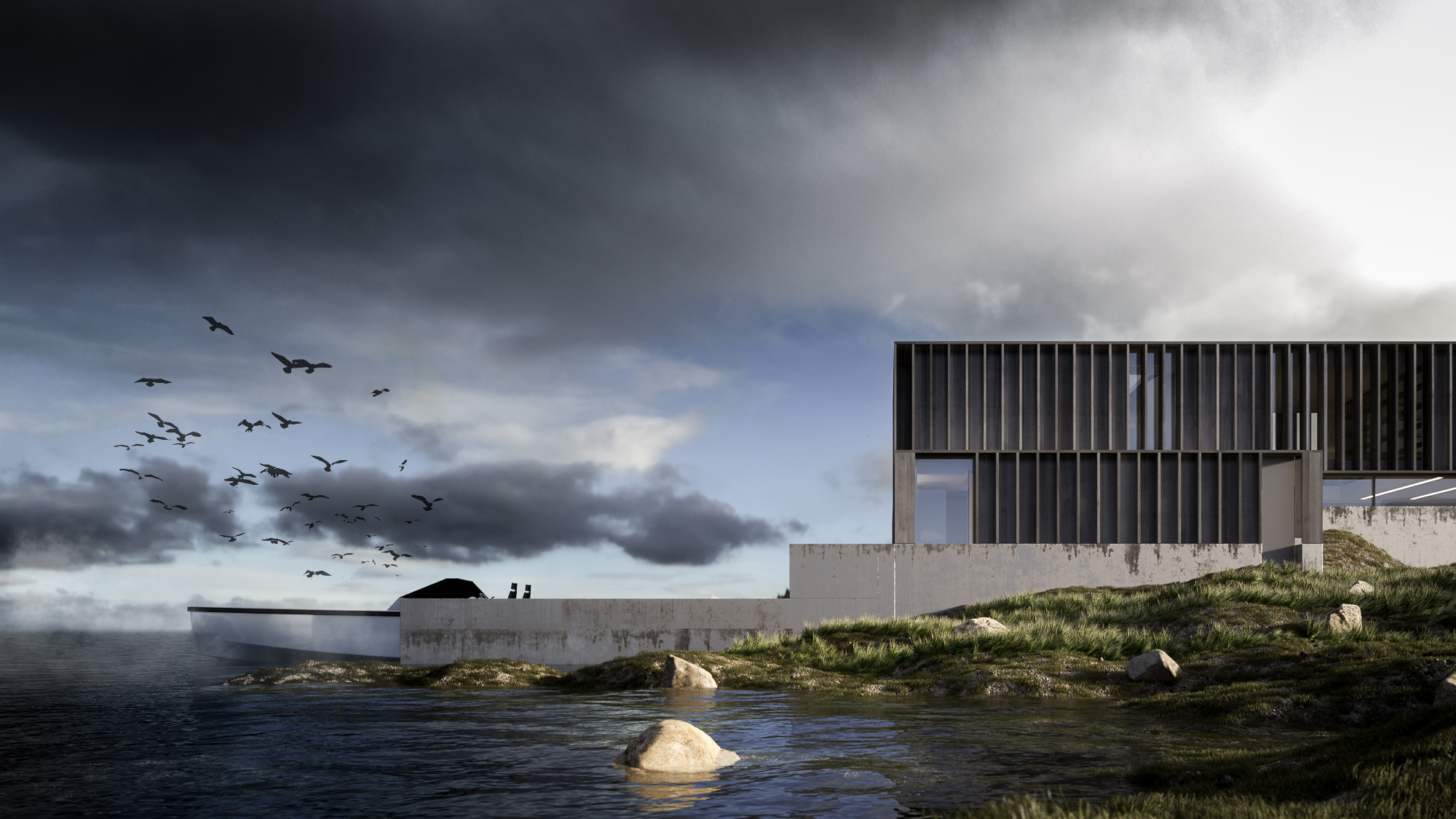
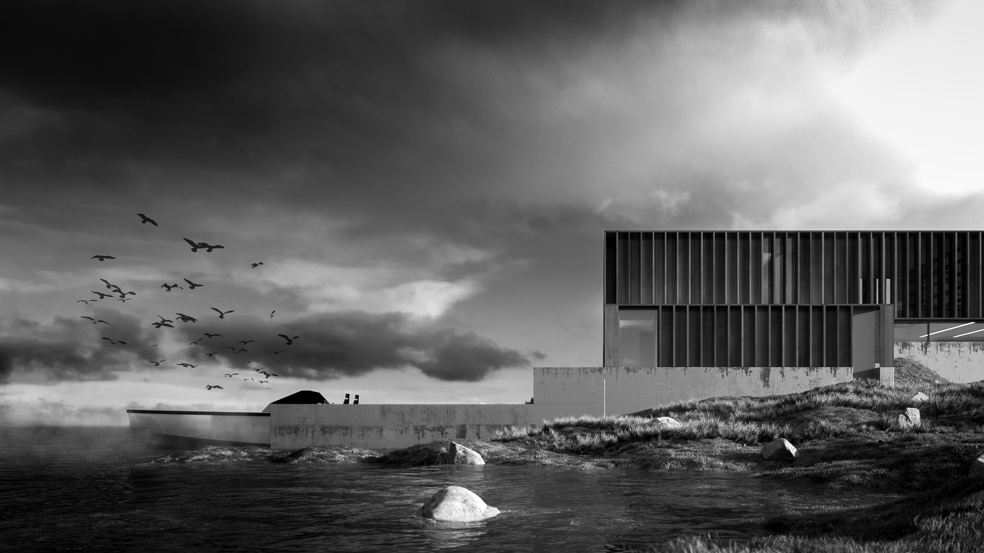
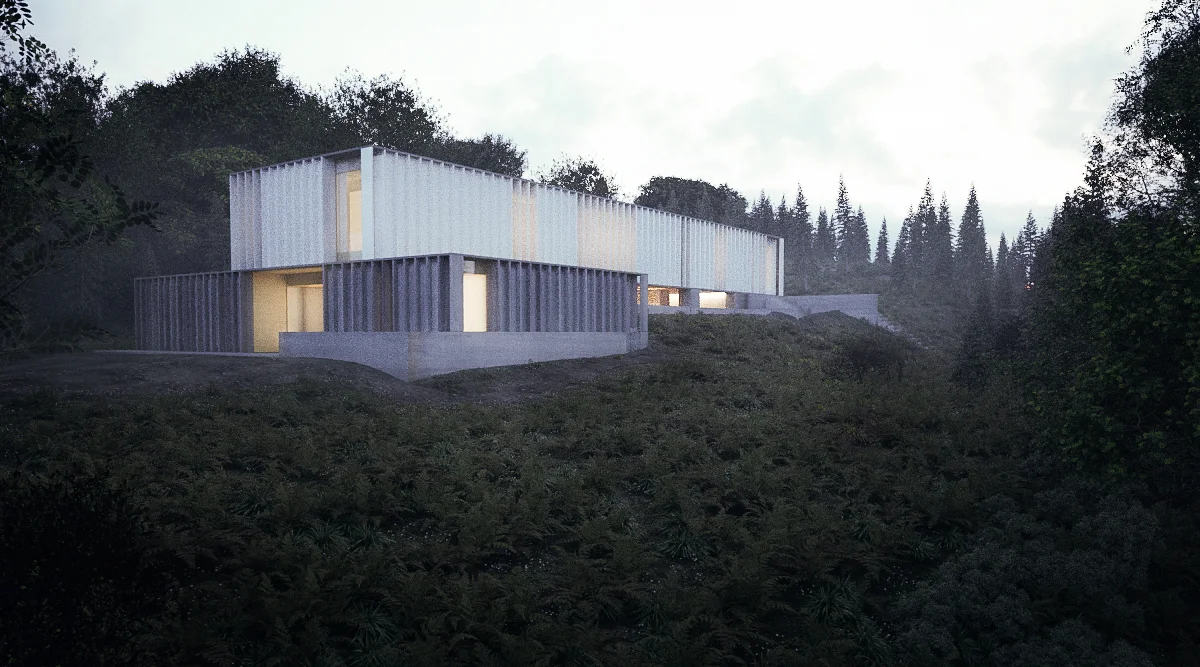
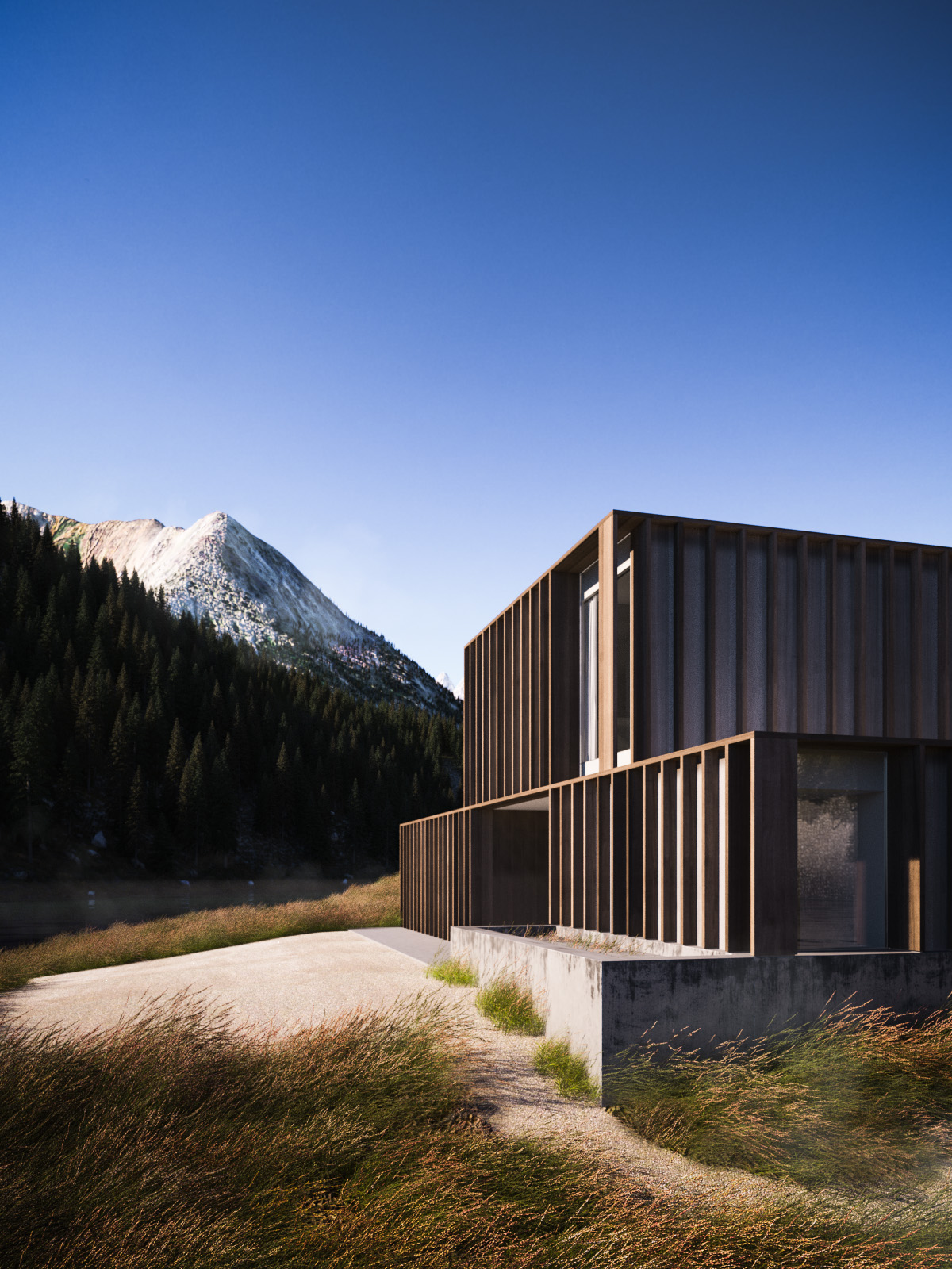
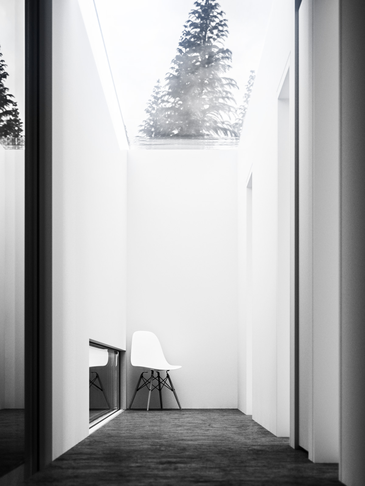
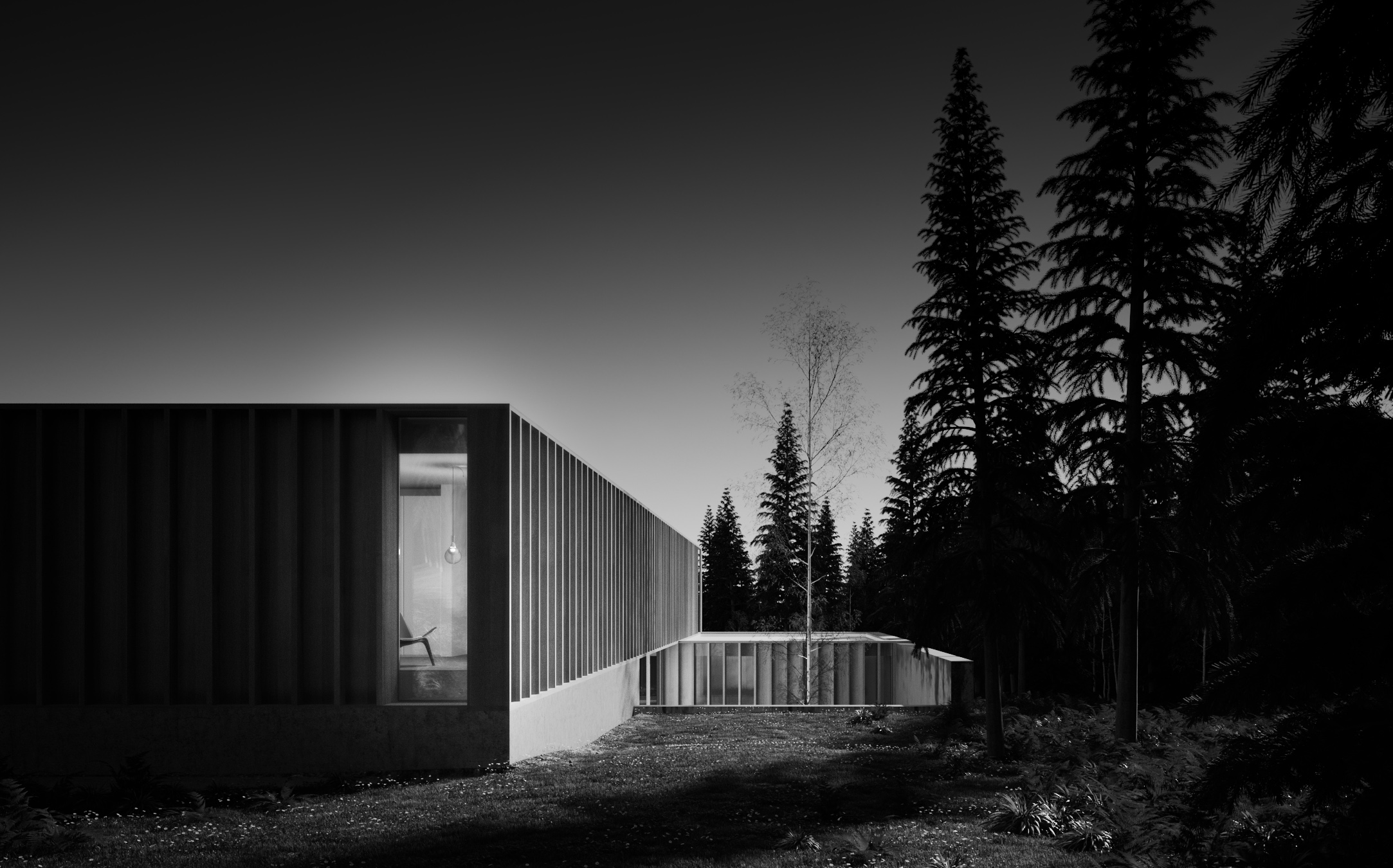
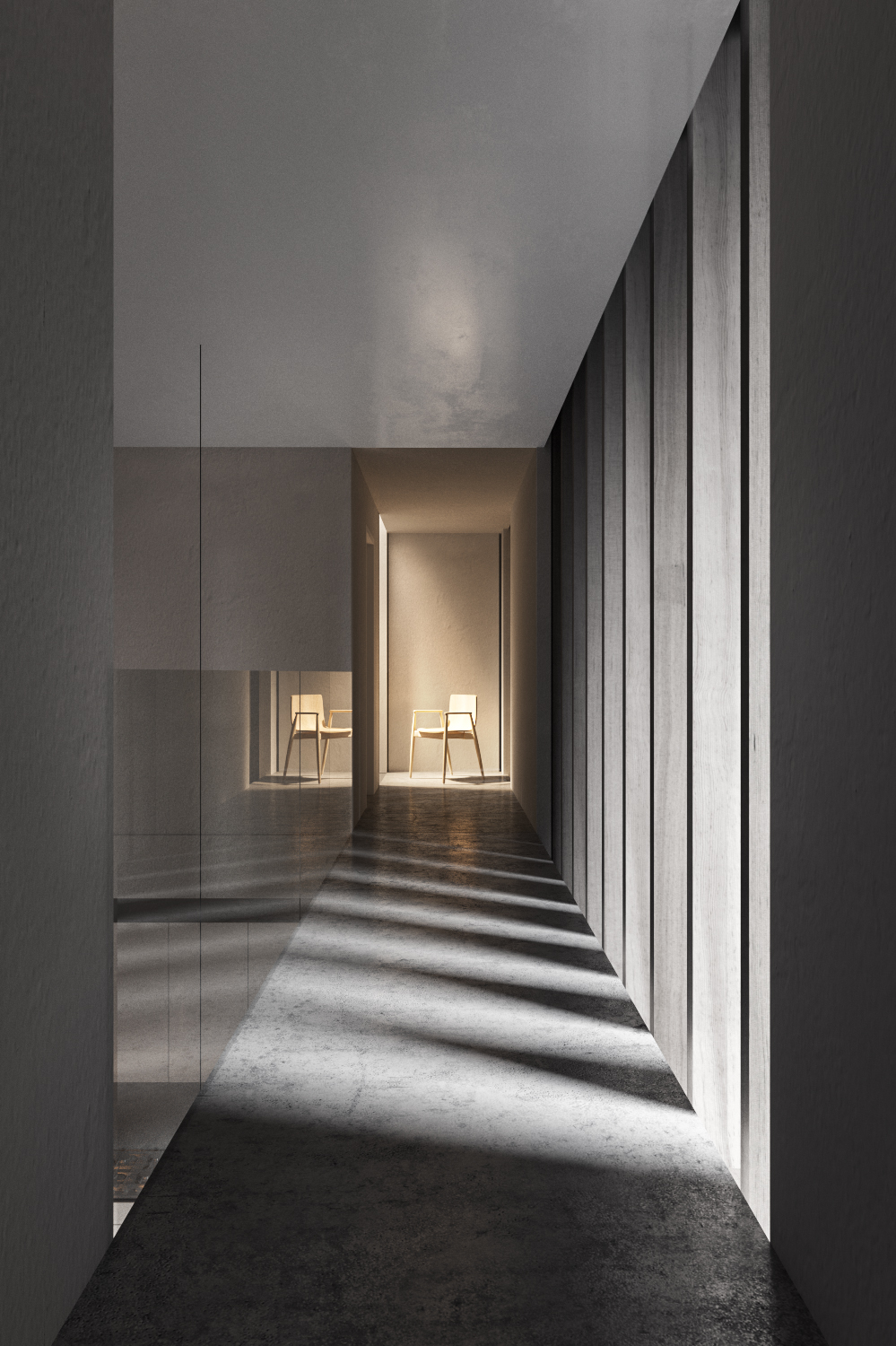
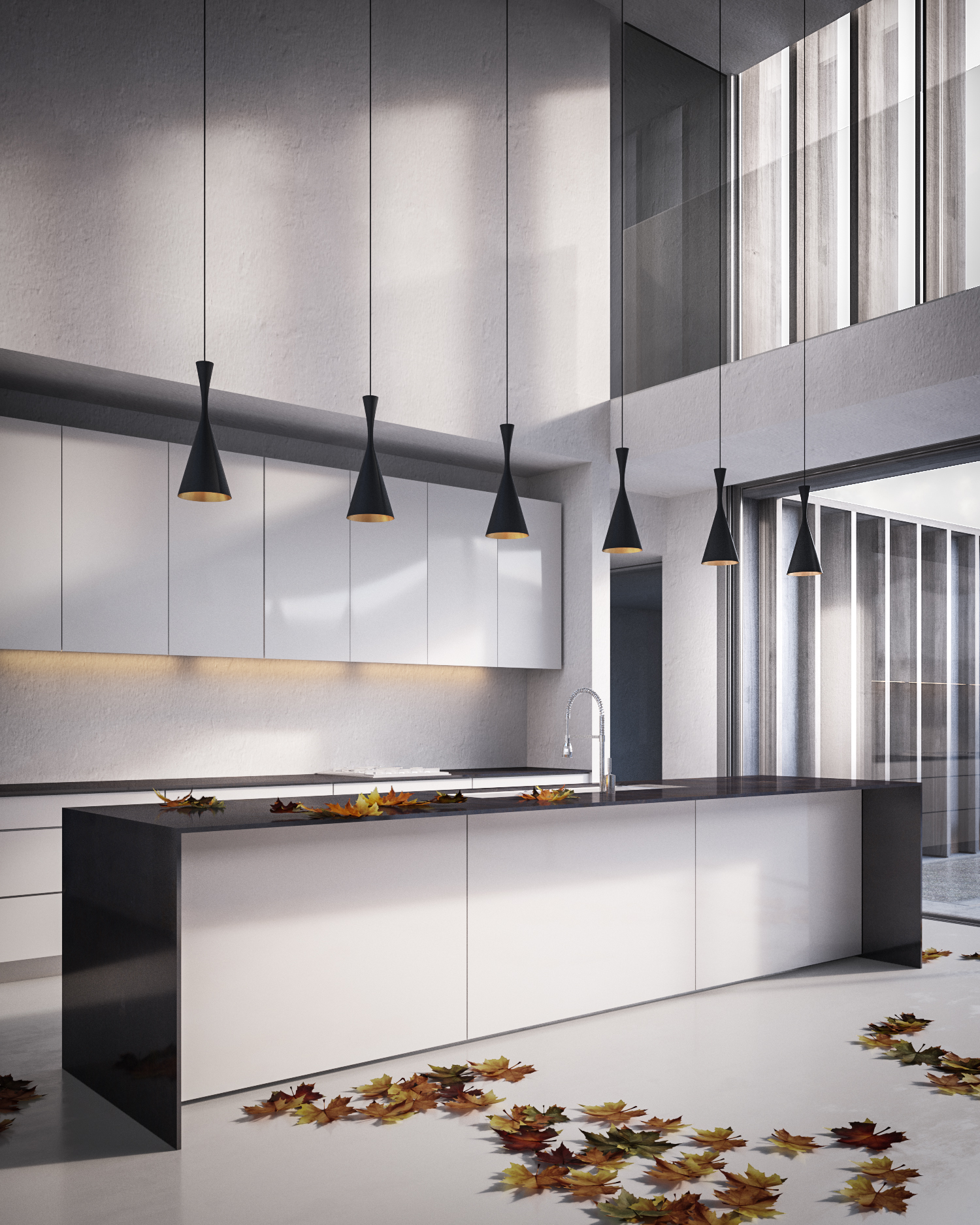
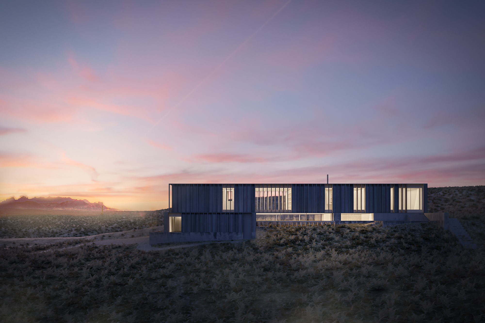
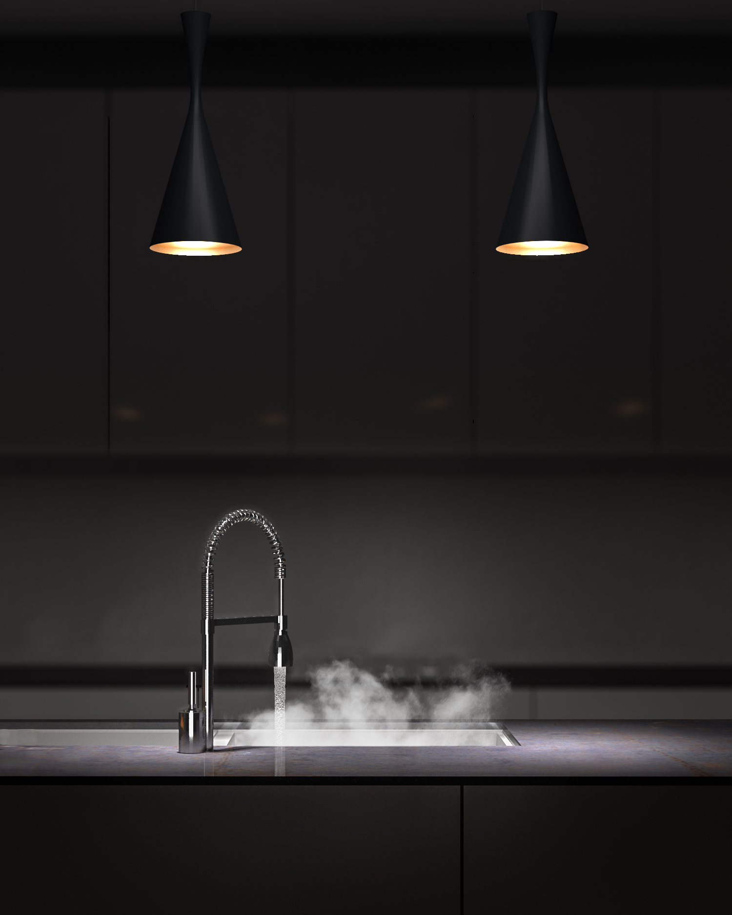
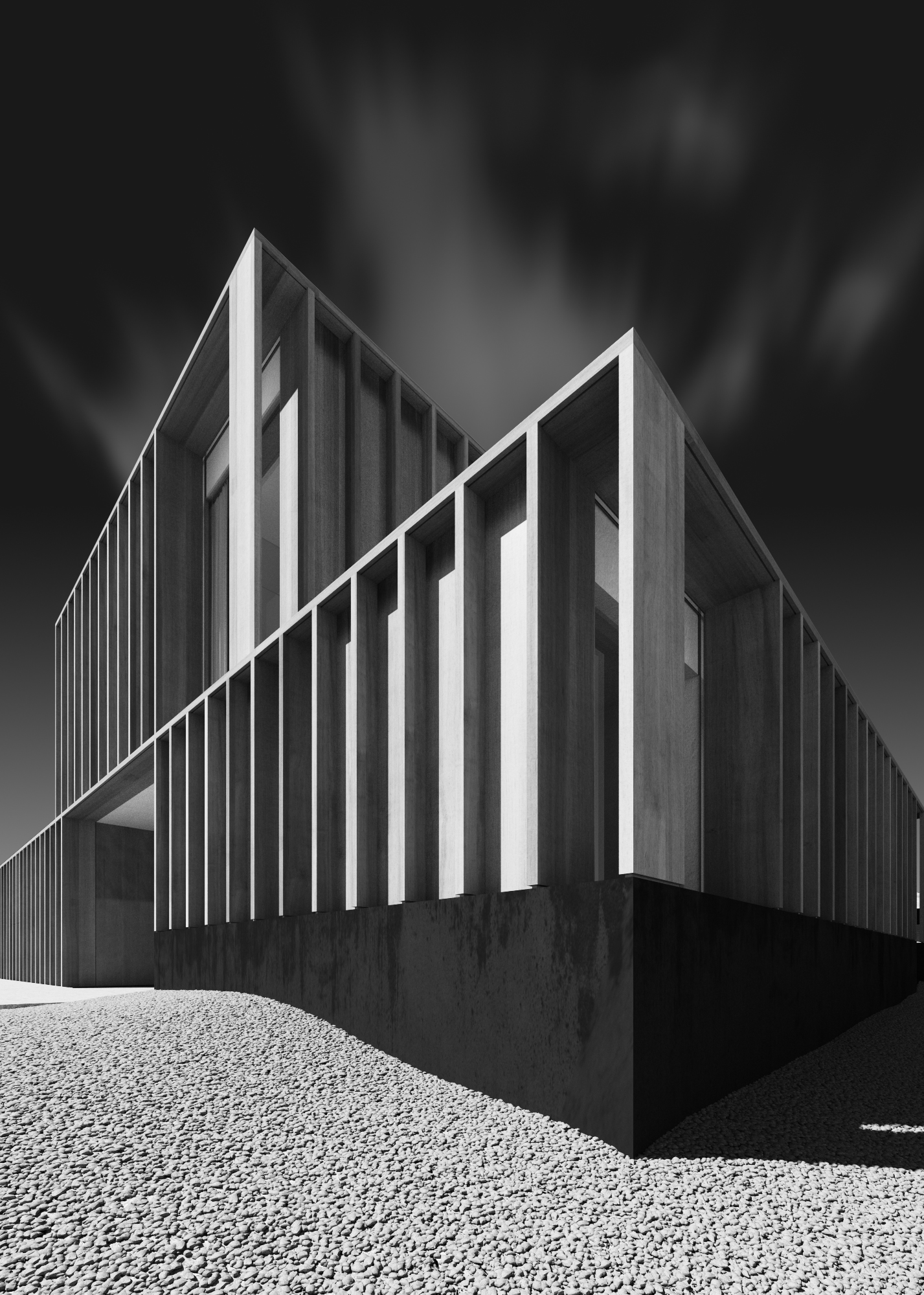
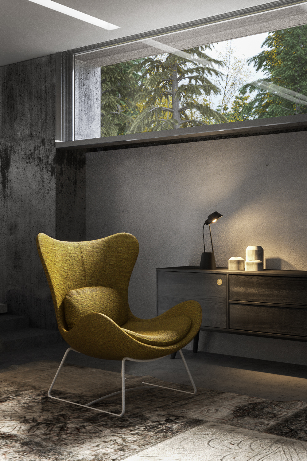
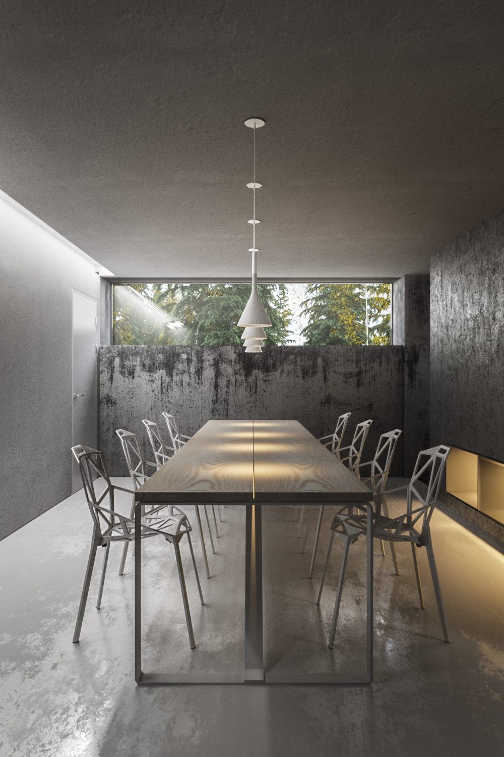
With the second masterclass done and dusted its time to review the images and reflect again on how much great work can be completed in just one week by a group of talented and enthusiastic visualisation artists.
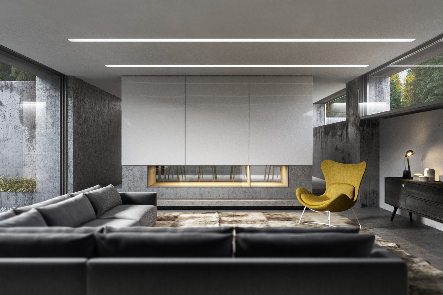
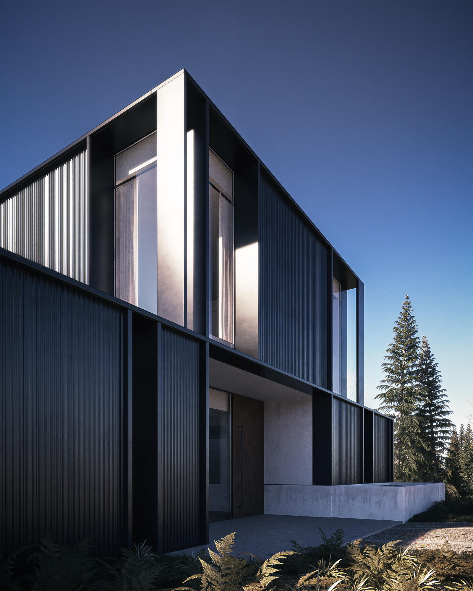
This year the project we used as a base was Strom Architect's Superhouse which was a complete 3d scene that Phil Hunter did for The Boundary last year. Students were encouraged to change the environment and lighting and even to alter the architecture if they felt that way inclined (some people really got stuck in!).
All images were produced using either vray or corona, with a lot of forest pack pro and either my PG Skies or vray/corona sun & sky.
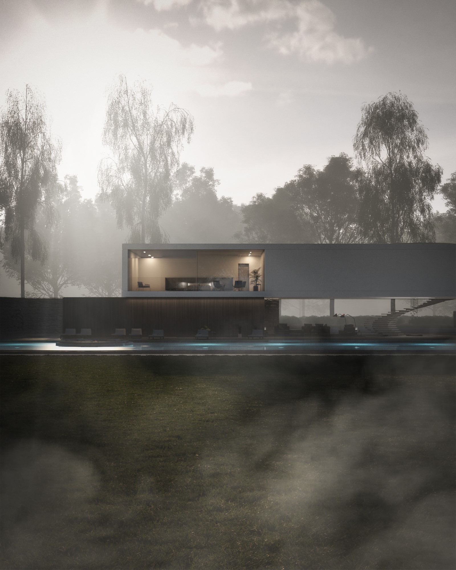
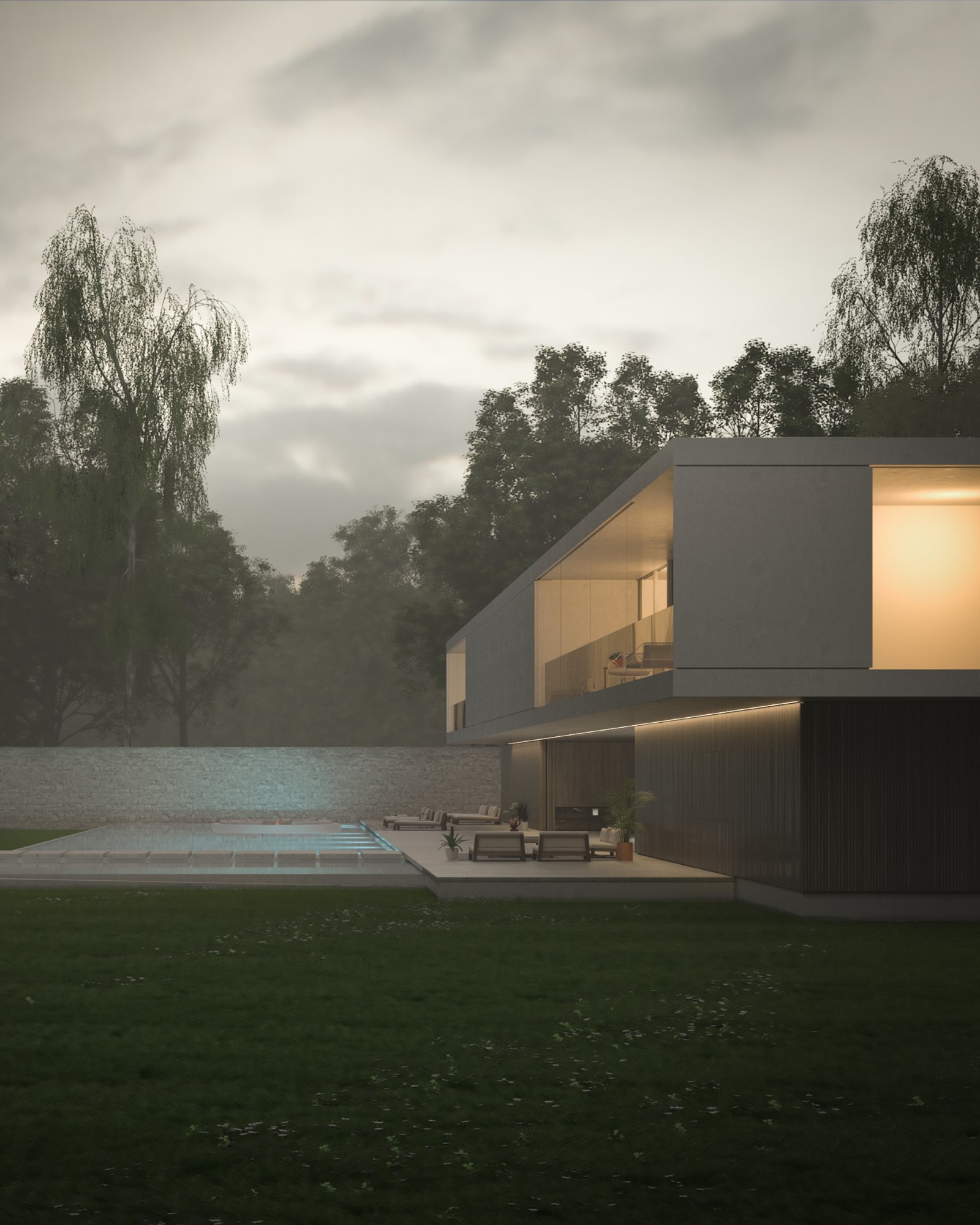
Bence Fischer - http://www.brown-blue.com/
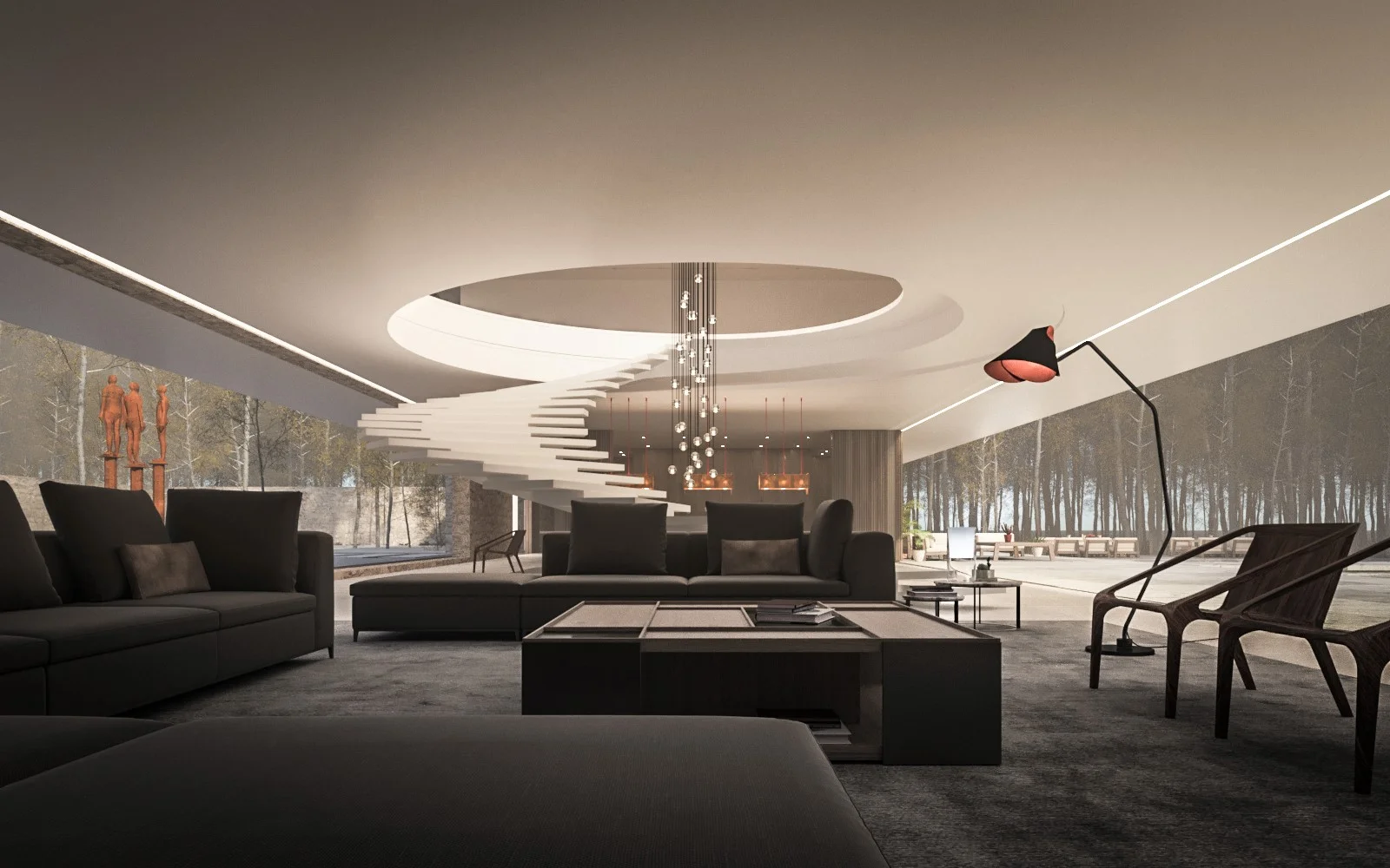
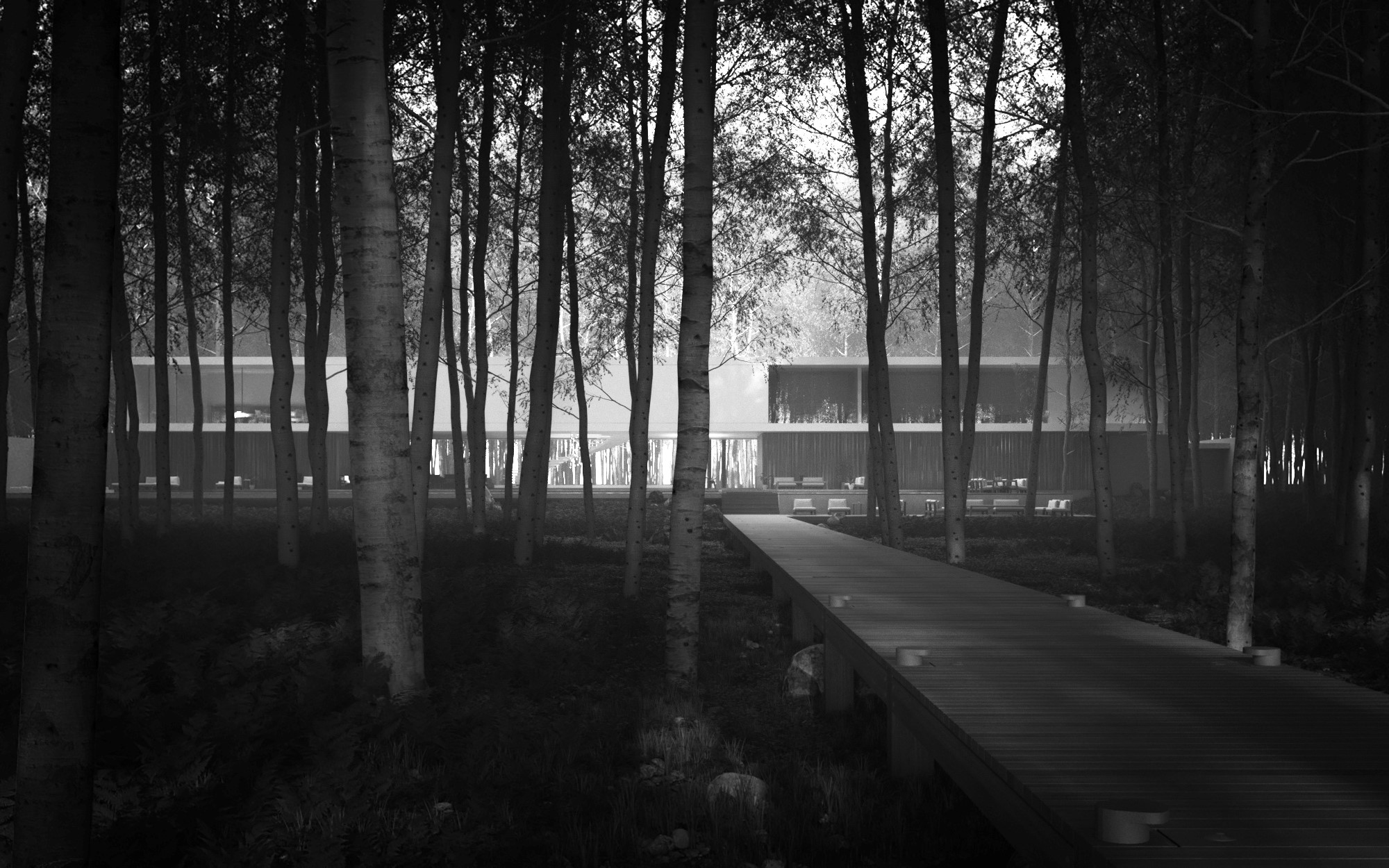
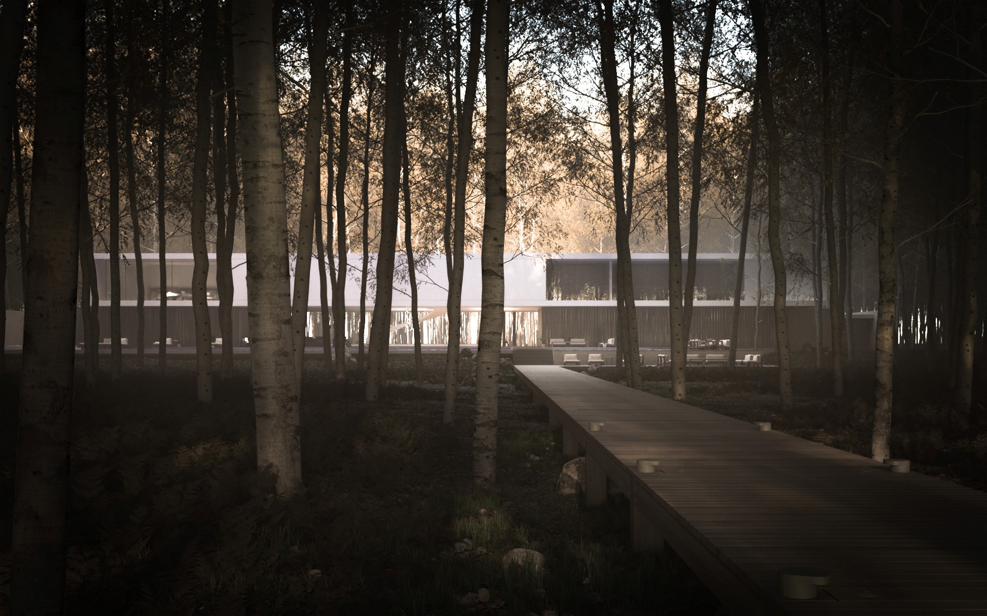
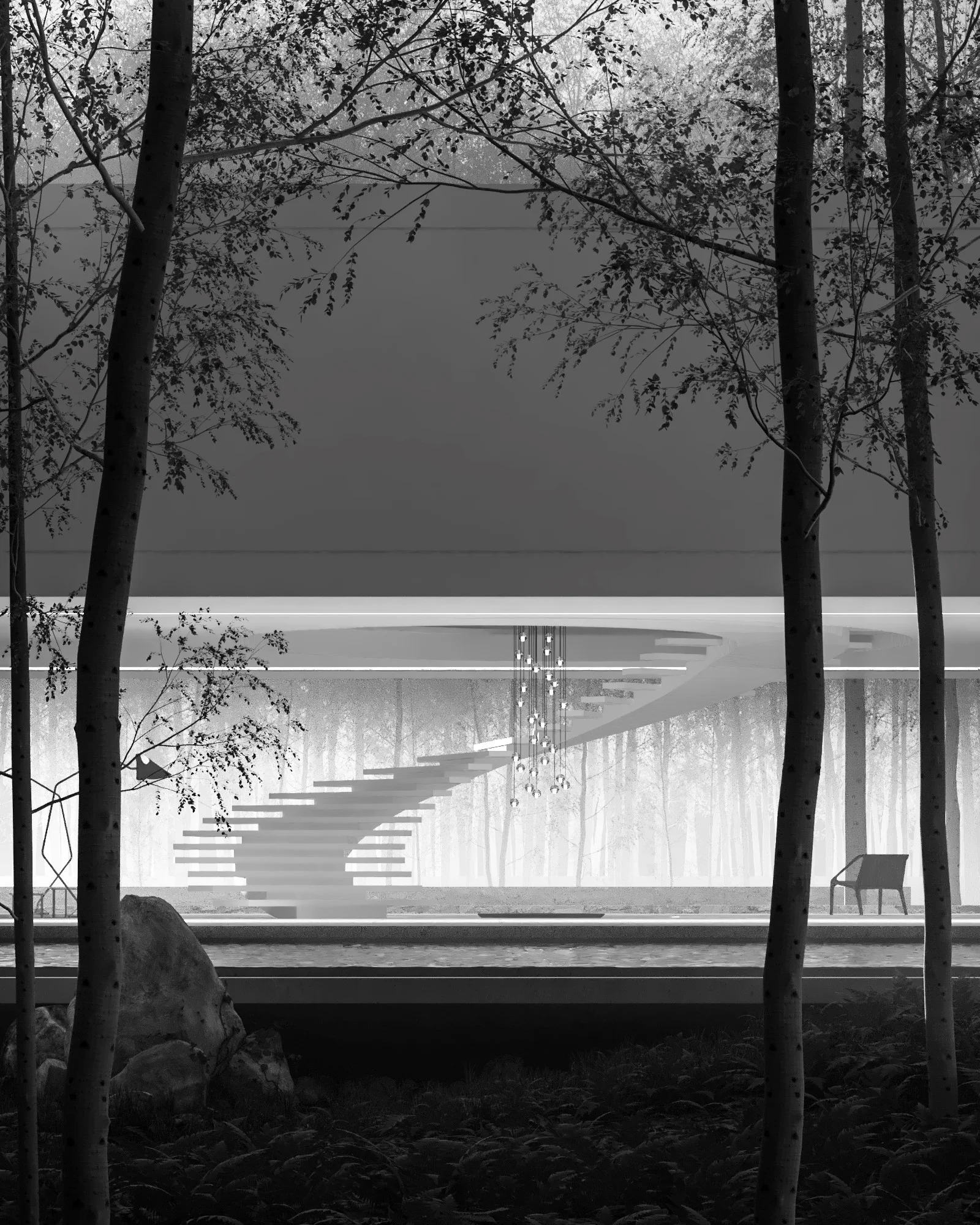
A simple clearing in the woods provided the backdrop for a lot of experimentation with lighting and mood. Some strong shots and a very seductive view of the spiral staircase. Bence wanted to make a version with god rays similar to my Farnsworth House renders from many years ago, but ended up with something darker, moodier and probably better.
Brian Sørensen - http://brianbaastrup.com/
I loved the idea of nestling the Superhouse in a cliff face and it was also technically very well executed. A favourite amongst many of us here at The Boundary.
Christian Schreinert - https://www.facebook.com/chris.alexander.ms
I can only assume Christian needed to get away from the day job for a while and indulge in a bit of creative escapism. Amazing amount of work and was fun for me to see the scene and ideas develop. A relatively calm lighting setup as that's what was needed.. I'll let the image speak for themselves,, enjoy:
Dung Nguyen - http://www.behance.net/badung
Dung made an amazing landscape in the first 2-3 days and then focused on finding 3 or 4 strong compositions. I hope what comes across in his renderings is that once he had this base for experimentation he really tested a lot of different HDR skies and moods through the use of heavy atmospheric effects. A pleasure for me to see the variation that can be achieved once you have set everything up simply by changing the lighting.
Daniel Szalapski - http://www.keyframe3d.com/
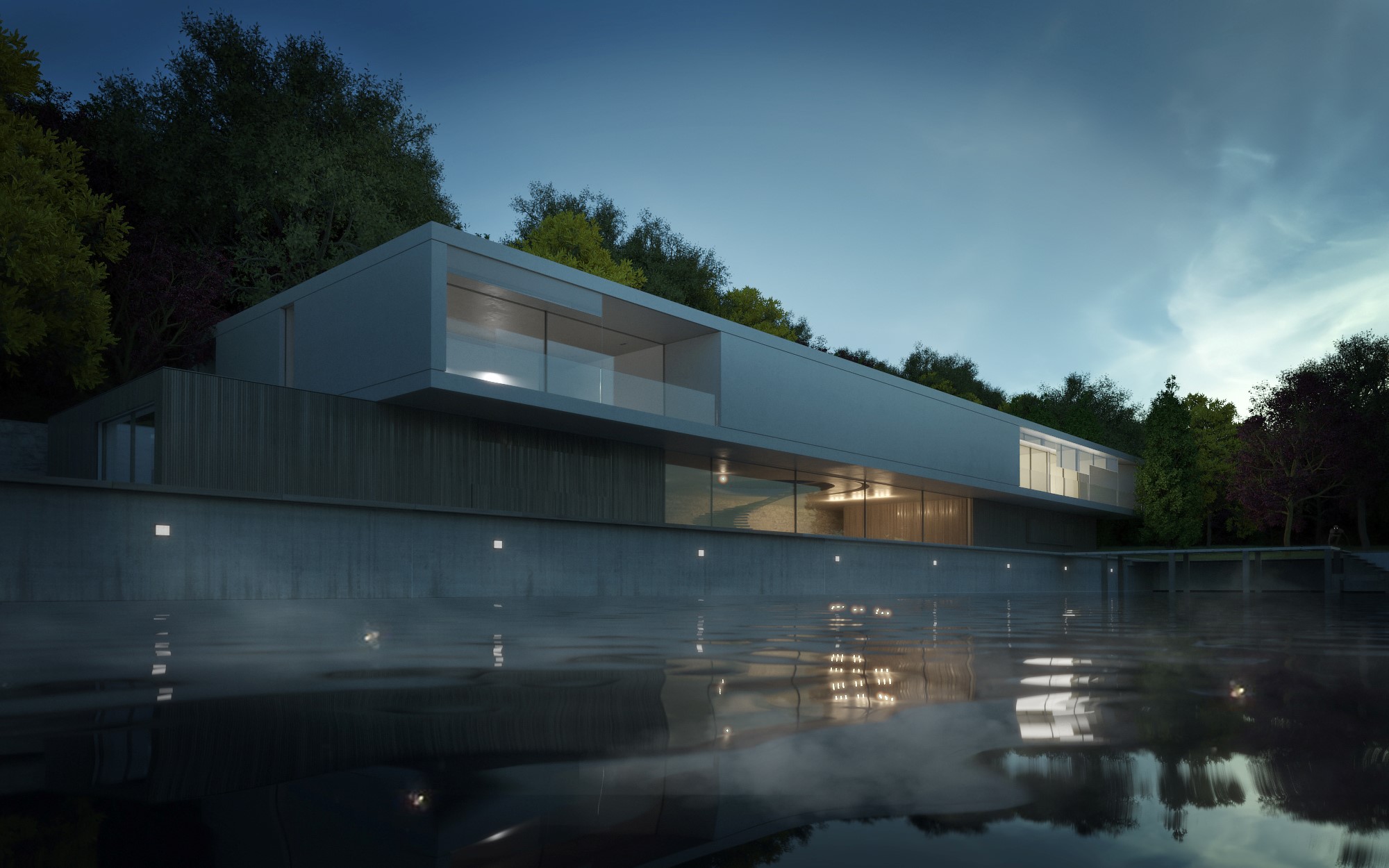
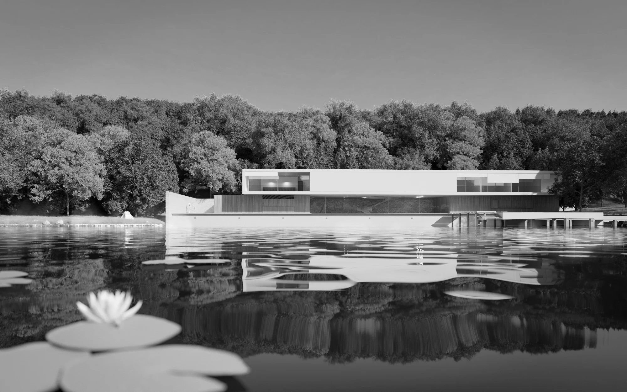
A very refined set of images from Daniel, who set the Superhouse on a lake and came up with a couple of lighting setups that really suited the environment. A strong b&w shot and I especially like the dusk shots which really make the Superhouse look appropriately Super.
Eleonora Galimberti - http://www.eleonoragalimberti.com/
A beautiful photograph from dezeen provided the inspiration for a Superhouse set deep in the jungle. Eleonora hadn't used Forest Pack very much but managed to create a really good looking backdrop for her Superhouse images. Deliberately low key images help to make the architecture look very sophisticated and encourage the viewer to look for more in the images. The three landscape shots are amongst my favourites from the whole week.
Hala Hanna - https://www.behance.net/HalaHanna3d
Hala went for a Mediterranean feel which I think works very well with the architecture. Some very strong compositions, both rigid and symmetrical and also more free flowing. Theres a very nice quality of light and the final shots have a very nice soft feel to them.
Maayan Golan
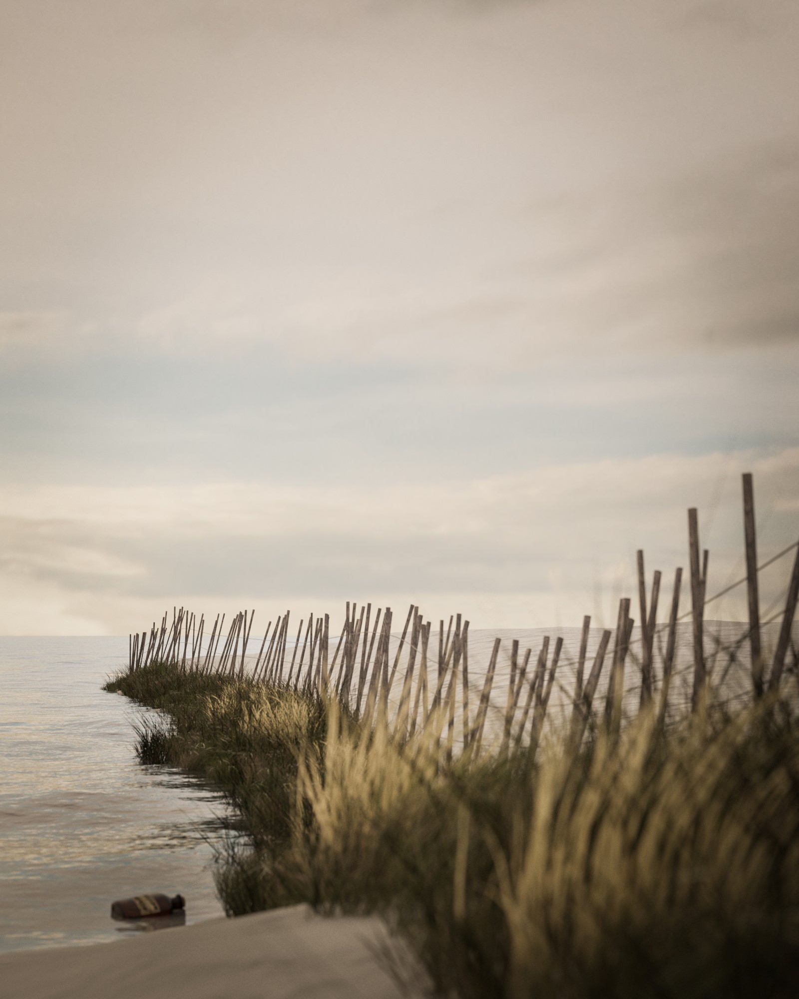
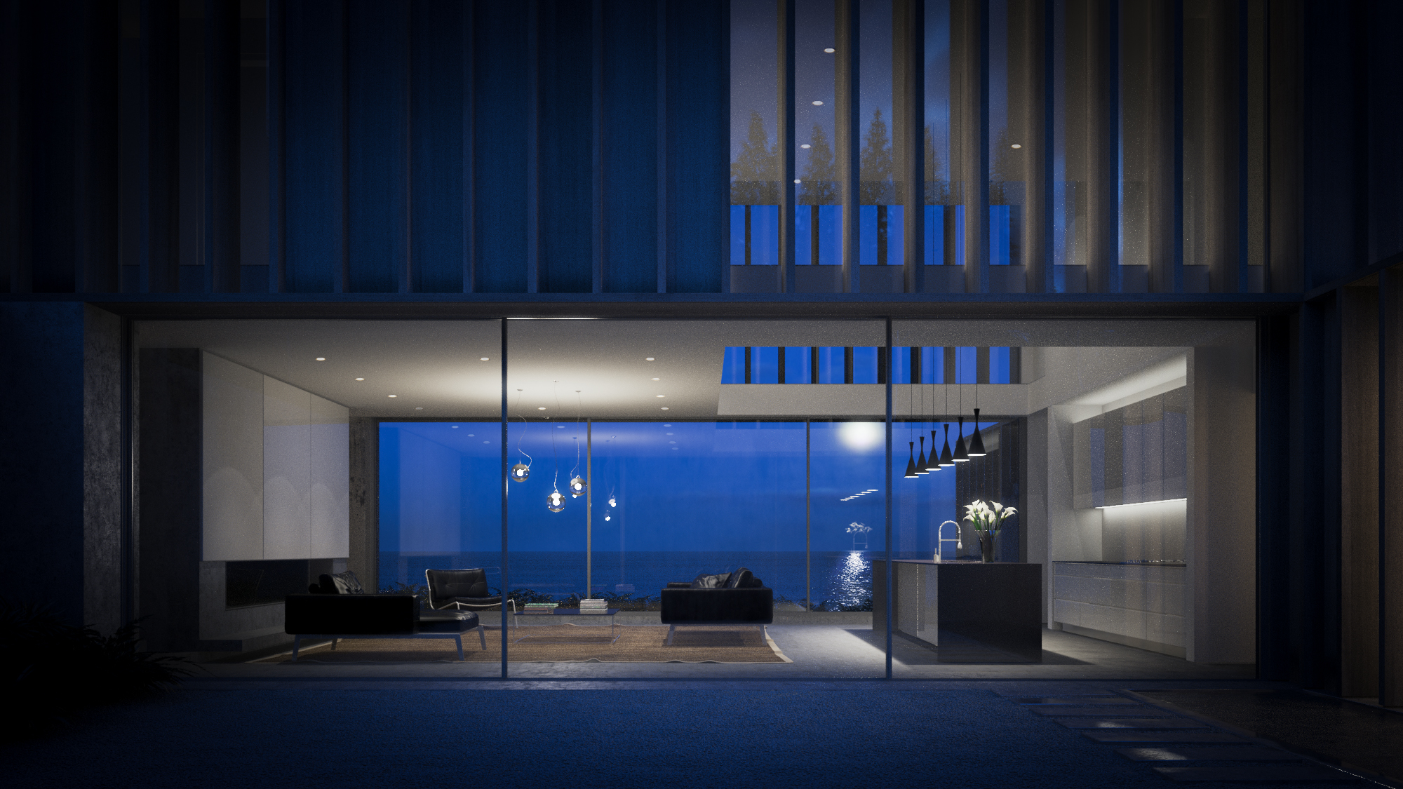
Mayaan started from a great reference image of the sea which set the tone for her set of images. A bit of testing of lighting to figure out how to match the reference image and then constructing a seaside environment. I encouraged her to do a detail shot of the fence since it have been so expertly modelled.
Ronen Bekerman - http://the-craft.co
A pleasure to work with Ronen as always, and especially to show how I like to approach making a 3d scene, keeping options open for compositions and lighting. A strong concept, great lighting and also a beautiful colour palette.
Rocco Valantines - http://www.mmpaa.eu/
Rocco is an architect and took my invitation to play around with the architecture to make it respond to the environment seriously. I love the landscape he created, and the way the HDR skies chosen seem to fit with it perfectly. A really strong set of images that came from a lot of testing of cameras and different lighting setups.
Sebastian Kraus - https://www.facebook.com/sebastian.kraus.5011
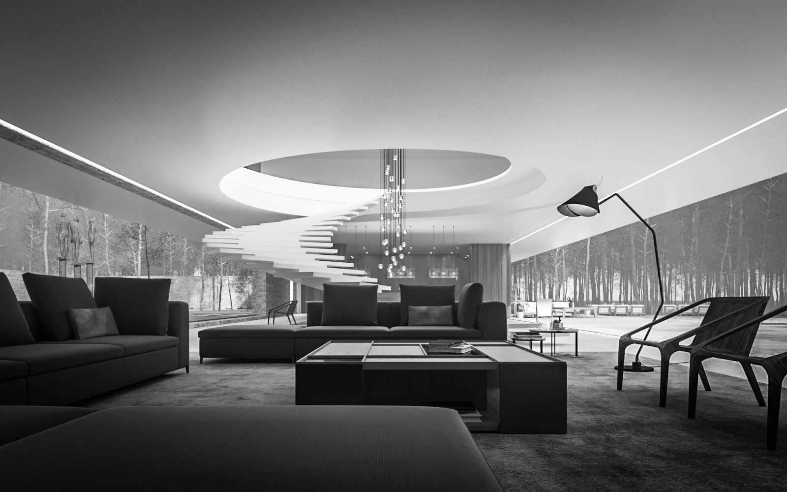
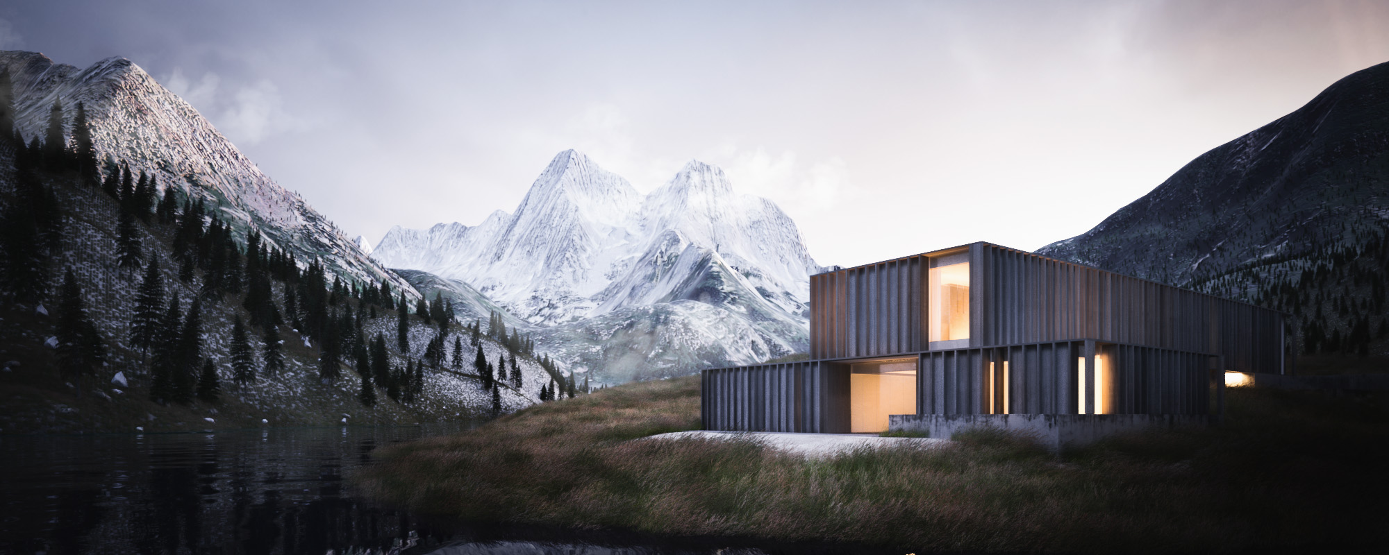
Sebastian managed to hold his enthusiasm for Photoshop in check long enough to make a great wintery alpine landscape as a base for exploring lighting and compositions. The interior shot took on a cool high tech feel and became know as the James Bond shot and I particularly liked that Sebastian took advantage of seeing a potential composition in a Photoshop reflection pass to create the staircase detail shot.
Yaroslav Rojen
Yaroslav went for a wintery scene, initially based on my 'Twins' project, but once we started playing with lighting it took on it's own feel. Great attention to detail, and snowmen!


