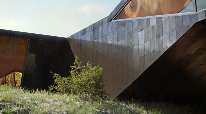
A short 3d intro for Stöten Ski Resort made in collaboration with Panama Channel.
Made with 3dsmax, vray, multiscatter, snow flow & after effects
The actual terrain was actually imported into 3dsmax via google earth>sketchup.
A short 3d intro for Stöten Ski Resort made in collaboration with Panama Channel. Made with 3dsmax, vray, multiscatter, snow flow & after effects The actual terrain was actually imported into 3dsmax via google earth>sketchup. www.panamachannel.se www.peterguthrie.net
A short 3d intro for Stöten Ski Resort made in collaboration with Panama Channel.
Made with 3dsmax, vray, multiscatter, snow flow & after effects
The actual terrain was actually imported into 3dsmax via google earth>sketchup.
I just have to share these amazing interior renders by Bertrand Benoit - easily two of the best interiors I have seen. Click through to flickr to see them bigger and for the rest of the series.
This was a fun 1 day job I did for Norkay, the people I share an office with. It's an advert for Dalarna Business to show (with a sense of humour) how local businesses might grow in the future. Norkay came up with the concept and the idea for this image, I then designed and modeled an airport, rendered it and montaged it into a photo of the existing Mora airport. Oh, and I added some reindeer and a sleigh for good measure.
Double page spread in the local newspaper, Falu Kuriren.
Concept by Norkay, photography by Ulf Palm Fotograf, visualisation by me.
Don't let anyone tell you sketchup is not a 'serious' modeling program and that it produces untidy geometry, like any program its how you use it that counts. The genuis of sketchup lies in it's tidy interface, brilliant snapping, and ease of use. Sketchup has it's limits of course, but for architectural visualisation I think it is the perfect tool for modeling. Every single project in my portfolio started life in sketchup. The start of any project for me is understanding the building and modeling it - as quickly and as efficiently as possible. This timelapse screen recording shows the whole process, speeded up 10x. The whole thing took about a day (3 hrs 46mins, excluding all the coffee breaks). I like to get the overall form of the building done first, but identifying and making components for any repeating elements (windows, doors, whole apartments) as I go. You can then go back and add detail later on.
Don’t let anyone tell you sketchup is not a ’serious’ modeling program and that it produces untidy geometry, like any program its how you use it that counts. The genuis of sketchup lies in it’s tidy interface, brilliant snapping, and ease of use. Sketchup has it’s limits of course, but for architectural visualisation I think it is the perfect tool for modeling. Every single project in my portfolio started life in sketchup. The start of any project for me is understanding the building and modeling it - as quickly and as efficiently as possible. This timelapse screen recording shows the whole process, speeded up 10x. The whole thing took about a day (3 hrs 46mins, excluding all the coffee breaks). I like to get the overall form of the building done first, but identifying and making components for any repeating elements (windows, doors, whole apartments) as I go. You can then go back and add detail later on.
A little personal project inspired by Jown Pawson's recent Plain Space exhibition at the Design Museum in London. These renders take a lot of inspiration from Gilbert McCarragher's beautiful photos of the exhibition. My main interest in doing this was to capture the same quality of light as in the photos, I love the blue light from the sky in contrast to the warm concealed lighting under the benches. You can view the renders at a bigger size on Flickr
HDRi sky used in this series: 1123.

In case you haven't seen it, Ronen has wrapped up the latest arch viz challenge on his site, Hover. I really enjoyed following everyone's progress, and just wanted to share my favourites here (along with some commentary on each!).
My personal favourite entry was Tolgahan Güngör's imaginative interpretation of the brief. I know this wasn't his final entry but they were all very good. I loved the design, composition and lighting. There were maybe some technical things that could have been better, but for me they aren't so important when the overall mood is right.

Next up is Micael Dillner's entry. A strong concept, the environment here really appealed to me, and I liked the composition a lot too (I know the judges disagree with me here!).

Finally Benjamin Brosdau's sleek modern house. It was fascinating following the development on his thread, if you haven't looked through it you really should. Great attention to detail, incredible modeling and texturing, there's lots to learn there for everyone. Considering the promise shown though, I felt the final 2 images needed a bit more work in terms of lighting and composition. The final exterior shown here seems to be a bit in between an exciting dynamic view and a stiffer straight on view (like Micael's above). I'd like to have seen some more experimentation in composition and lighting before settling on the final entries. Here is an example of the stunning attention to detail shown on Benjamin's WIP thread:

Congratulations to everyone who took part, and well done Ronen for another great challenge!
Seeing as its almost that time of year again, I thought I'd share some progress on an exciting new project I'm working on.
The snow is mostly done with the brilliant snowflow plugin, some of the trees are from the winter trees collection at rendering.ru and some are made with onyxtree and have snow applied using snowflow. I still haven't decided on the mood and haven't even begun to think about views.
Let me know what you think, and if you have any ideas!
EDIT:
The sky hdri numbers used were 1008, 1929, 1725, and 1928
The Phoenix Flowers is a new public realm intervention by 7N Architects in Glasgow, Scotland. I worked on the 3d visualisations in September last year and was very interested to see photos of the completed project by my ex-colleague and friend Dave Morris. At the time I remember being happy with my work but not completely sure how 'real' the images looked. As it turns out, the red carpet and flowers are even more intensely coloured in reality! Take a look at the full set of Dave's photos here, below are a selection for comparison. When I saw Dave's photos I felt I had to go back and render a couple of extra views, so the 2 below were done to try and match his compositions.
render:
photo:
render:
photo:
For me, the interesting things to notice were the relative intensities of the highlights (how the Canon 5D dealt with them compared to vray), the colour of the lighting behind the grilles (goes towards yellow in reality despite being red) and that I was pretty lucky in getting the flower petal material looking about right.
Not a new technique, you can find good tutorials by Bertand Benoit and Philippe Steels here and here, but it remains the best way to create displacement maps for repetitive things like roof tiles, metal panels and in this case expanded metal mesh. The great thing about doing a material like this with displacement rather than a straight opacity map is that it looks different depending on the viewing angle, which adds to the realism.
I made a quick model of expanded metal that looks something like this:

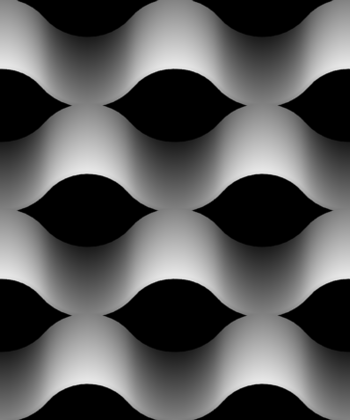
then did a quick top-down render and saved the zdepth element as a 16 bit png. Its important to save as 16 bit if you want a nice clean and smooth displacement, 8 bit often doesnt have enough grey levels so you get a stepped gradient which looks ugly when displaced.
This is what the finished displacement map looks like:

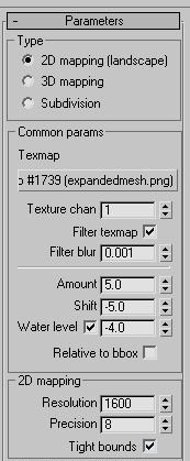
If you use vray, then the displacement settings were (units: mm) :

The actual material settings were very simple, a brownish diffuse colour, slightly more pink reflect colour, ward brdf
And finally some renders (click for higher res):
Following on from the last post, this is a selection of my favourite interior views of the Allandale House for wojr.org. Click images for high res.
The HDRi sky used for all of these shots was 1008.