I'm proud and happy to have been nominated for the inaugural 3D World magazine CG awards in the arch viz category.
Lots of talented artists and companies there, remember to get your vote in before the 11th of August!

I'm proud and happy to have been nominated for the inaugural 3D World magazine CG awards in the arch viz category.
Lots of talented artists and companies there, remember to get your vote in before the 11th of August!
This is just a quick post to answer two of the most commonly asked questions relating to my HDRi skies: 1. Why does it look weird in photoshop?
This is because when you open the exr or hdr file in photoshop the default exposure level is very high, you can simply drag the 32 bit exposure slider up and down to preview the full range
quick screen recording to show how to preview the full dynamic range of my hdri skies
2. How do I load the exr/hdr in 3dsmax?
I normally use them in a vray dome light, and load them using the bitmap loader. I like to keep the multiplier of the dome light at 1 and adjust the output of the bitmap to control the intensity of the exr/hdr sky. If you use a physical camera approach then you can usually keep the output value at 1, if not, you might need to lower it as far as 0.005.
Remember to set the mapping to environment and spherical.
UPDATE A:
An alternative way of loading exr/hdr files if you use VRay. I have been using this method for quite a while now and enjoy the extra level of control the VrayHDRi loader gives me. Not only does it provide easy access to gamma controls for the HDR sky (see here for more info: HDRi Lighting Workflow), you can also use the two available multipliers to bring the HDRi exposure range down to be viewable in the viewport, and then ramp it up again at render time. In the screenshot below I have an overall multiplier of 0.02 and then a render time multiplier of 50 (bringing it back to 1.0).
Feel free to ask questions, I will update this FAQ with anything useful that comes up.
I go into more detail on how I use hdri skies in my HDRi sky lighting tutorial and even more detail on using HDRi skies together with a vraysun here.
First up some of my favourite images from my latest work for Willian O'Brien Jr.. As usual you can click through to see the full set on flickr.
LANDSCAPING
As with the Allandale House, the landscape mostly came from my imagination, with this as a starting point:

We first tried out an autumnal scene with lots of browns/greens contrasted with white stucco clad houses, but I was especially keen to try a snowy scene (winter was still on its way at the time!). After modeling the house in sketchup, I placed it and a rough terrain also made in sketchup into a new 3dsmax scene and started creating a snowy landscape. This was done using the snowflow plugin to make snow cover over the whole terrain object and then the snowplug tool to remove snow from where it shouldn't be. This is how the terrain plus snow looks in the viewport:

The snow material came from a vray.info video on new vray 2.0 features and is a blend of a vraysss2 material and a vraycarpaint material. This results in a subtle SSS effect and also nice snowy sparkles from the carpaint material. Admittedly you never appreciate the complexity on my finished renders, but it does look nice up close! Snow material set up:
Next up was to source and/or create snow covered trees. Click the image below for a slideshow of all the trees and bushes used in the scene (11 total), I always think its amazing how few unique trees you need to create a believable forest:
In hindsight I should probably have added some more pine trees, on some of the views you can see repetition in the tall scots pines.
I ended up buying a winter tree pack from rendering.ru which I thoroughly recommend, the ash and birch trees are beautiful. The fir trees are from evermotion and I added snow to them using snowflow. That process was a real headache. My advice would be to detach a branch and test settings on it first. Start with low mesh settings and gradually add to the particle count until it looks OK. The pine trees are from "HQ plants 2" by 3dmentor.ru and I added snow to them myself.
typical snowflow settings (scene units are mm)
I used forest by itoosoft to scatter the trees. There ended up being just 3 forest objects; one for the tall pines and firs, one for the birch and ash trees that make up the edge of the forest, and one for the snow covered planted area between the houses.
On the screengrab above, you can see the splines that are used to define different areas, and also to thin out the forest at its edges. Also evident is the clustering of plants which is a great feature in forest, it really helps make the forest look more natural and is very quick to experiment with too.
LIGHTING
As always my favourite part of the project was the lighting. I knew I wanted to go for another subtle diffuse light set up, so experimented with some suitable HDR skies from my shop. The ones I tried were 1008, 0902 and 0743 but ended up going for 1008 again (as Allandale house) as having even a slight amount of warmth from the sun didnt look right.
I used vrayenvfog with a mesh as a gizmo to keep the fog away from the actual houses (didn't want fog inside!) and a fog distance of 450 metres. No maps controlling density, colour or emission. The fog is set to scatter GI as it looked nicer and there wasnt much difference in render time. If I had gone for a darker time of day, having the interior lights interact with the fog outside the windows would have been really interesting, maybe next time!
Colour balance was very important in this scene, and was something I experimented with right up to the final renders. Initially I had a very neutral colour balance, with slightly warm interior lights, but eventually I grew to like the blueish tint more and more. Being able to change kelvin values on lights and on the camera makes this process very intuitive in vray. I appreciate being able to think about these things in photographic terms rather than tweaking rgb values. I set the vrayphysicalcamera white balance to 4200K which gave a nice blue tint, then I had to push the interior lighting down to 3100K so that they still looked warm.
Vray Light Lister: I have some fill lights which I set to have no effect on speculars or reflections to speed up renders times slightly. The main dome light (1008) had the subdivs increased to 16 from 8 as it seemed to give more accurate shadows, but above 16 didnt seem to make much difference (it will be very scene dependent but is worth playing with the dome light subdivs to see how it affects noise).
FURNITURE
The houses are left intentionally stark and bereft of home comforts in order to highlight the abstract nature of the volumes and the views out to the surrounding landscape. The few objects were chosen to try and give a timeless quality and because I thought the clean lines worked well with the houses.
I went for:
FINISHING TOUCHES
I used vray lens effects for the bloom and glare, which worked out really well I think. It's best to experiment with the values on interactive mode till you get something you like. Bear in mind that you really need bright light sources if you want seductive looking glare. My interior spotlights had vraylightmaterials applied to them and the float value (right click and hold on the vrayFB to inspect rgb/float values) was often up around 5-20.
Once in Photoshop, I added a slight s-curve to boost the contrast more on all the images. I added some detail to the snow, tracks from people, skiers etc. by copying and pasting from reference images and setting the blending mode to darken.
People often ask about my render settings, so I'll share there here even although there isn't anything remarkable about them. Note that they are optimized for rendering all the foliage quickly, normally I would enable detail enhancement and retrace threshold. As it was the interiors looked OK without DE and retrace threshold.
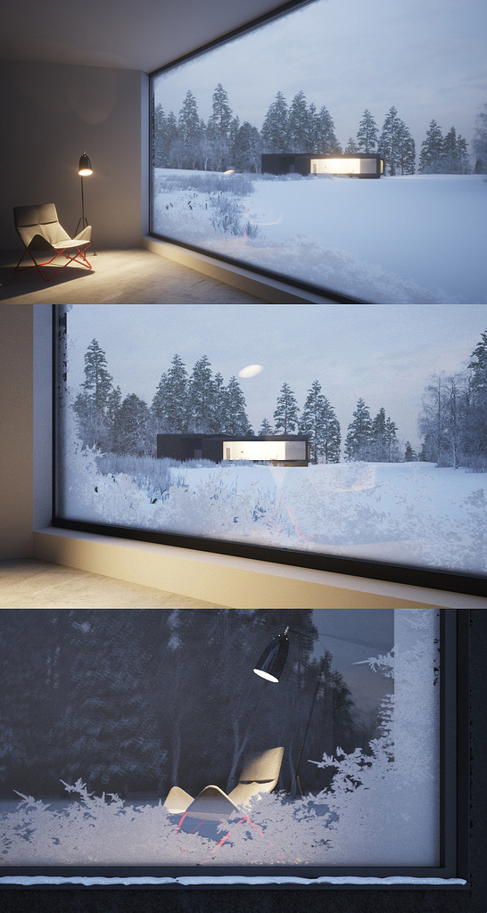
I am very grateful to my client for his patience and willingness to try new things. Some things I tested didnt end up making it to the final images though! I tried making frost covered windows, and snow cover on the roofs, but they ended up being distracting to the architecture. Its easy to get carried away with small details and forget that the focus of all the images should be the architecture.

New set of images for a company specialising in architecturally designed eco friendly buildings. I used a lot of elements from previous jobs here, the grass is the same as on the Ekerö project and the trees are all from my library. Brix was handy for making some very quick brick walls, multi texture map from cg-source.com for randomising the timber textures.
Thanks to Burn Studio for the free imac model!
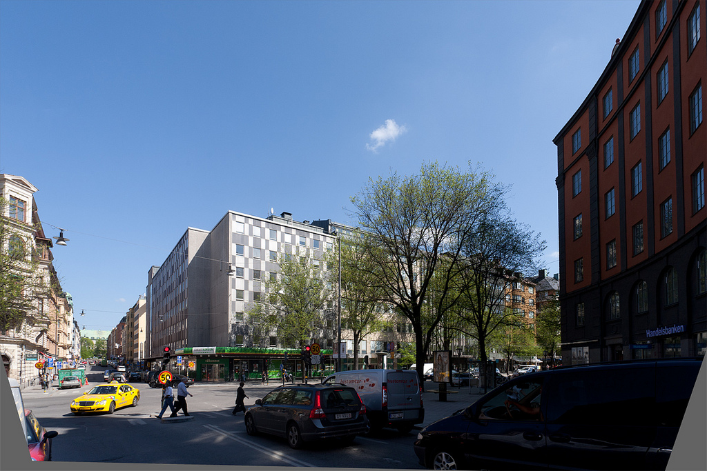
I've been neglecting my blog lately due to having too much work to do, so to try and get back into the swing of things I though I might as well put this up here (even although its not a tutorial). I like to do as much as possible in Lightroom when it comes to processing photos, its so handy to keep everything raw and then even when I do need to make a jpg for uploading to the internet I tend to bin them afterwards. One thing that annoys me though is how LR does perspective correction. In my opinion PTlens (a cheap plugin for photoshop) does it well, in that it looks believable, whereas LR's output always looks a bit squashed.
The two programs clearly use different algorithms, but which is more 'correct'?
Lightroom:

PTLens:

and a comparison between the two showing how much taller buildings appear in PTLens:

I don't have aperture but would be interested in knowing how it handles it. Also, if there is a way of stretching an image in LR please let me know! Otherwise, I must say I am very pleased with the lens correction presets in LR (for barrel distortion correction).
My workflow just now is to camera match with the uncorrected version in 3dsmax and then do PC control afterwards in photoshop. How do you camera match a TS Lens in 3dsmax, is it even possible? (with a degree of accuracy)
Kilburn Vale by Gianni Botsford Architects.
I loved GBA's Casa Kike when I first saw it, so this was a very exciting commission for me.
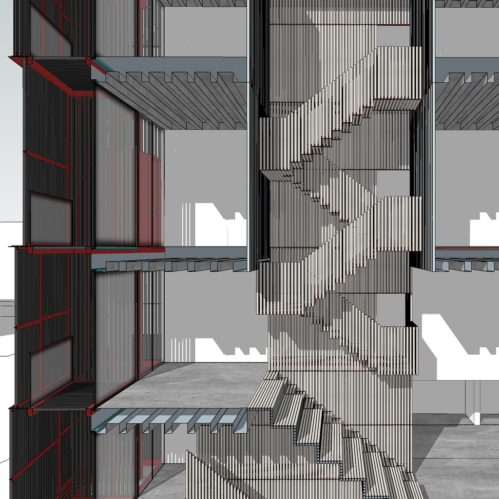
As usual I started by building a very detailed sketchup model (thanks for your help Bojana!). It's quite a simple building, but with a lot of thought in the details:


I try to do as much as I can these days in sketchup, even roughly positioning textures which then get replaced by vray materials in 3dsmax.
The external terracotta louvres were given a cg-source.com multi-texture map to randomise the colour of each louvres very slightly, this really helped in adding some realism. (Maybe I could have used the new vray multi subtexture map? haven't figured it out yet)
All the furniture was chosen by the architect, the main items were:
- Drop table, Living Divani. Designed by Junya Ishigami - Garden plate, Living Divani. Designed by Junya Ishigami - Family Chairs, Living Divani. Designed by Junya Ishigami - Loop Chair designed by Willy Guhl - Extrasoft sofa by Living Divani
The principle HDR skies were 2003 for the night time shots and 1739 for the sunlight ones.
AH#024 house by Thomas Sandell for Arkitekthus
My first commssion from arkitekthus.se is a house designed by one of Sweden's foremost architects and designers Thomas Sandell.
Technical info for those interested:
Building modeled in Sketchup, rendered at 6000px resolution in 3dsmax using vray, brix, forest pro.
Geeky vray stuff:
Irradiance map & light cache for the high res renders, universal method for the 1200px alternative lighting renders.
Furniture:
HDR Skies used: 0743, 1739, 1928, 2028
clay render
viewport
A short 3d intro for Stöten Ski Resort made in collaboration with Panama Channel. Made with 3dsmax, vray, multiscatter, snow flow & after effects The actual terrain was actually imported into 3dsmax via google earth>sketchup. www.panamachannel.se www.peterguthrie.net
A short 3d intro for Stöten Ski Resort made in collaboration with Panama Channel.
Made with 3dsmax, vray, multiscatter, snow flow & after effects
The actual terrain was actually imported into 3dsmax via google earth>sketchup.
I just have to share these amazing interior renders by Bertrand Benoit - easily two of the best interiors I have seen. Click through to flickr to see them bigger and for the rest of the series.
This was a fun 1 day job I did for Norkay, the people I share an office with. It's an advert for Dalarna Business to show (with a sense of humour) how local businesses might grow in the future. Norkay came up with the concept and the idea for this image, I then designed and modeled an airport, rendered it and montaged it into a photo of the existing Mora airport. Oh, and I added some reindeer and a sleigh for good measure.
Double page spread in the local newspaper, Falu Kuriren.
Concept by Norkay, photography by Ulf Palm Fotograf, visualisation by me.