Preparing textures in Photoshop

I have a mini tutorial on flickr somewhere on preparing photographed textures for use in 3d applications but can never find it so thought I would write it up properly for the blog.

These days I mostly take photos of individual textures rather than a whole wall or floor as there are so many great plugins like mightytiles, VP walls & tiles and multitexture that can take care of the randomisation for you. It makes the initial process of capturing the textures a lot easier for sure.

photos taken in a bit of a hurry as I had raised the suspicion of several security guards...

First thing I do is to run the photos through lightroom and make sure the color balance is the same on all raw files. Then I use the automatic straighten to try to square up the photo or the manual perspective tools if that fails. I then crop in lightroom and sometimes use the spotting tool to get rid of unwanted imprefections. Note that the colours are still a bit wild due to the uneven lighting, that can be fixed later.

In fact the camera's auto white balance probably did a decent job in retrospect, but if you are in a more controlled environment its usually a good idea to set the white balance manually in LR.

photo as shot

perspective quickly and roughly fixed to maximise the texture area

In photoshop, i then open the TIF that I exported, duplicate the layer for comparison purposes, then do a high pass of about 100 (radius) on it.

Filter>Other>High Pass

IMMEDIATELY after doing this, go to Edit>Fade High Pass change the mode to Luminosity and leave the opacity at 100% and hit OK. This brings back some of the colour info from your texture.

If at this point you are making a seamless texture, then you would use the offset filter (Filter>Other>Offset) and offset the image half of the resolution to the right and downwards, then tidy up the seams using whatever means you prefer.

Usually I am trying to match reference images for materials so a useful trick to get the colour right is to use the match color tool

Image>Adjustments>Match Color

and then select the source reference image (open it first in photoshop) and adjust the sliders till you get a decent match. Even if not matching a specific reference image, this step is great to make sure all your textures are harmonious in colour.

That's about it! Usually when making a Mighty Tiles texture I'd try and have 8 or more fairly high res textures.


PS. I have tried every seamless texture maker plugin going and never really liked any of them. Same goes for bump & normal map making programs. I always get better results taking my own photos and then trying to come up with a clever way of making a displacement map for it, if needed.

TIND panorama fun

Bit of a fresh take on old technology, but really quite effective I think. The resulting panorama is HTML5 so should be viewable on mobile devices too.

I asked for advice on the chaosgroup forum on what the best way of making panoramas is these days and the general consensus seemed to be that Pano2VR is the way to go. Apart from that, rendering a suitable image is very straightforward with vray:

  • Make sure your aspect ratio is 2:1 ie. width twice the height.
  • Set up your camera (I used a vrayphysicalcamera)
  • Under the camera settings in the vray render settings, change the camera type to spherical and override the field of view to 360deg.

the rendered equirectangular (?) image

Double clicking the panorama should launch it in fullscreen (IE and mobile users might have to make do with non fullscreen I'm afraid).

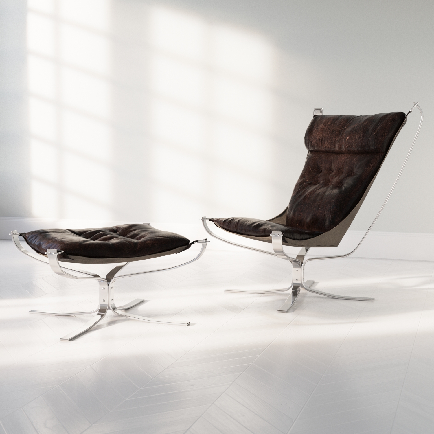
Sigurd Ressell Falcon Chair

Some quick renders of a great chair that my grandparents had in their living room and that I was always a bit fascinated by. Its the Falcon chair by a Norwegian designer called Sigurd Ressell.

Rendered with Corona, lit by '1739 Sun Clouds' HDR and NOT modelled by me.. I wouldn't know where to start!

The walnut floor texture can be found here: Orangegraphics

(not quite so) universal settings

With Vray 3.0, a new parameter has appeared under 'image sampler' called min shading rate. Inspired by some interesting discussion on the forum, I thought I'd find out what it does.

From help.chaosgroup.com

"Min shading rate - this option allows you to control the number of rays shot for AA versus rays for other effects like glossy reflections, GI, area shadows etc. It is especially useful with the Progressive image sampler. Higher values mean that less time will be spent on AA, and more effort will be put in the sampling of shading effects.

When loading scenes saved with V-Ray 2.x, the Min shading rate parameter is set to 1 in order to produce the same results as the previous V-Ray versions."

So.. as far as I understand it, it allows you to re-balance the work vray is doing away from AA (geometric detail, textures) and back to, ummmm all the other stuff (GI, lighting, reflections etc). That's as far as I get without my brain starting to hurt, so lets try it out in practice.

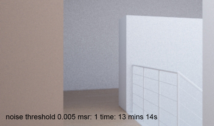
(click for bigger)  (for those interested, a shading rate of 20 took 15mins 46s)

The settings are all as per the vray universal settings and a noise threshold of 0.005, all I am doing is increasing the min shading rate from its default of 1.

As you can see, higher values don't necessarily mean longer render times in the world of adaptive sampling, presumably because the AA has less work to do as the GI, lighting, reflections and whatever else are cleaner. Don't ask me to explain this any further, I can't!

What is interesting to me though, is that at the shading rate of 6, not only is it faster, it is also less noisy. (marginal I know!)

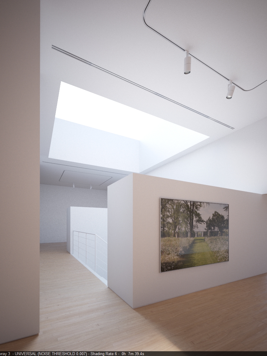
With that in mind, and with the object for me being to reduce the render time, I increased the noise threshold slightly to 0.007.

So in summary, a reduction of render time from 13 mins 14s down to 7 mins 39s, and looks pretty much identical. I'd guess that this approach will work best with interiors but let me know if you have any success with exteriors. 

EDIT: same testing procedure on an exterior scene below, as expected, not as much of a difference as with the interior.

Colour correcting HDRi skies

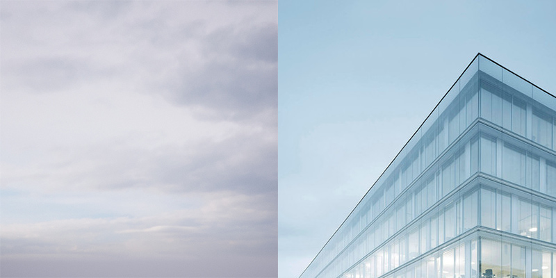
Photo by Brigida Gonzalez also on my scrapbook

Photo by Brigida Gonzalez also on my scrapbook

I quite often reference images I see on the internet when I am interested in achieving a particular mood or more often colour balance. This usually happens well into a project and quite often by accident rather than by design, but that's the subject of another, future post..

I liked the colour of the sky in the above photo, especially in combination with the pale yellow interior lighting. From looking through my HDR sky collection, I went for 0902 which was pretty close but not the right colour:

match01.jpg

I'm hoping chaosgroup will eventually grant my wish of adding some colour temp/tint controls to the vrayHDRi map, but in the meantime you can adjust the colour using the color map in the output roll up. I simply took some red out of the sky by unchecking G and B and dragging down the red curve.

output.JPG

Which results in a much closer match:

match02.jpg

You might be able to achieve the same thing with either the native max color correction map or colorcorrect but I think this is a neater solution. You could also colour correct the camera, but then you would have to compensate the temp of all of your lights as well.

Work-in-progress: a new project done in collaboration with Henry Goss for Ström Architects.

Work-in-progress: a new project done in collaboration with Henry Goss for Ström Architects.

Nordiska Akvarellmuseet

Happy new 2014!

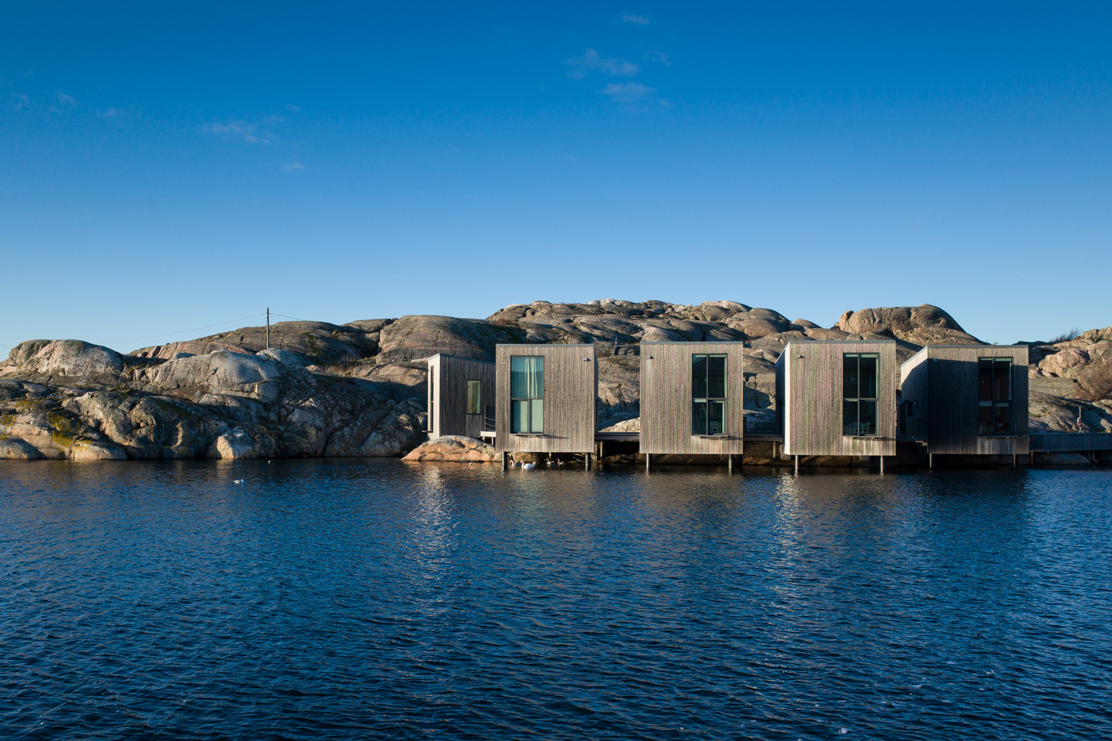
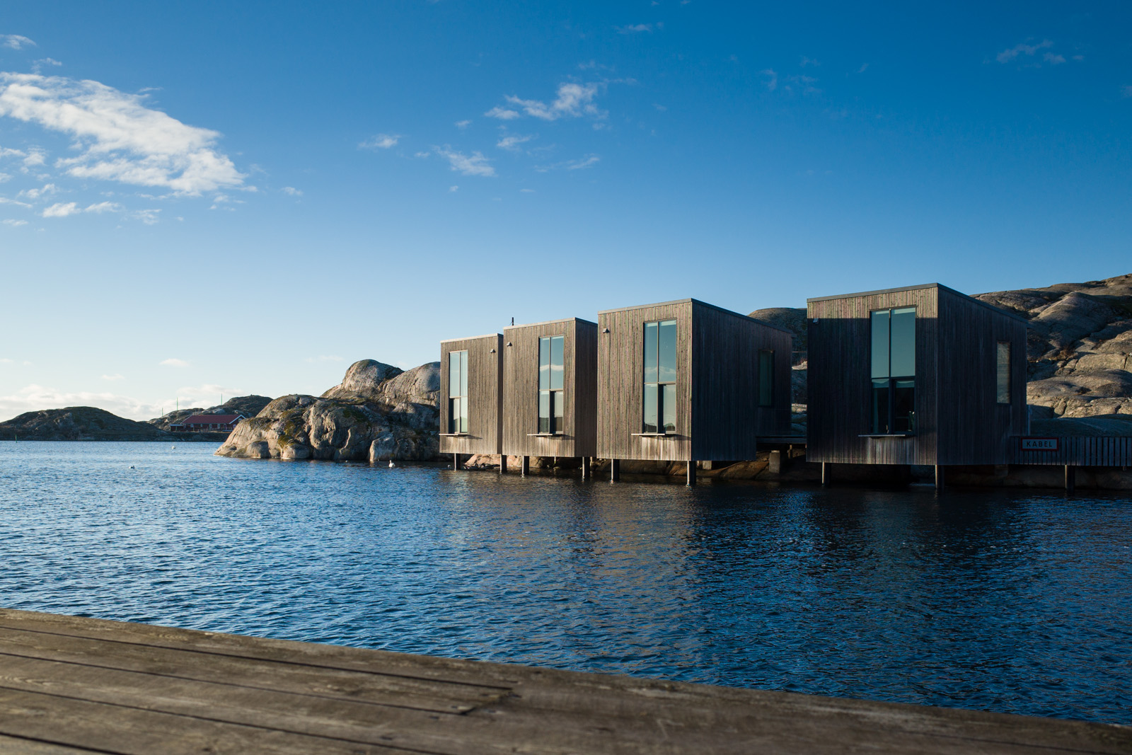
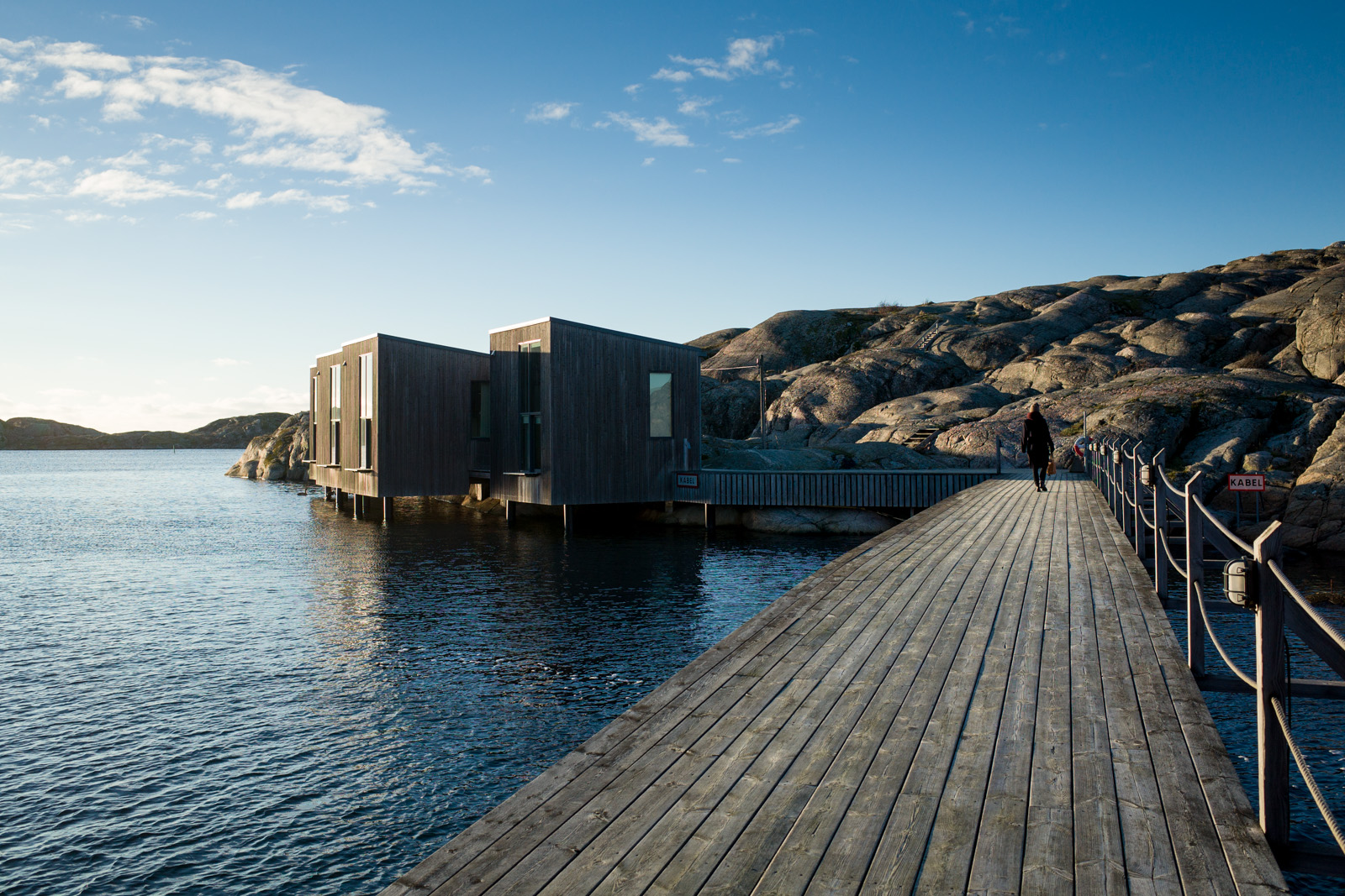
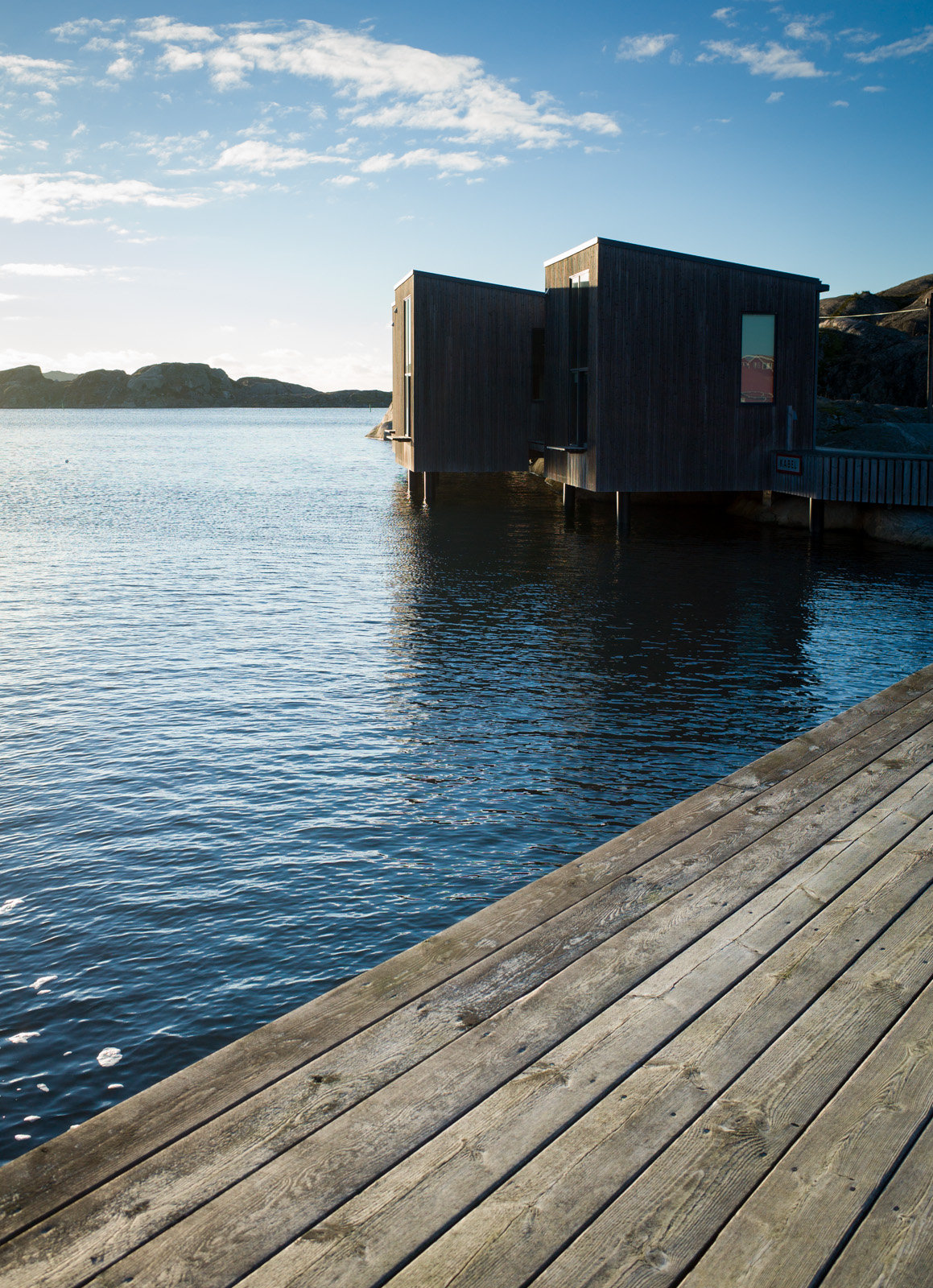
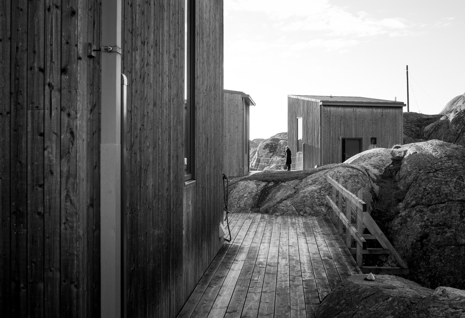
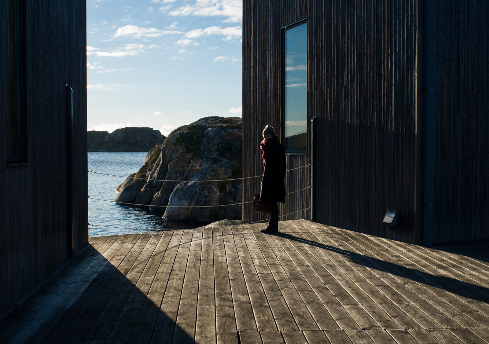
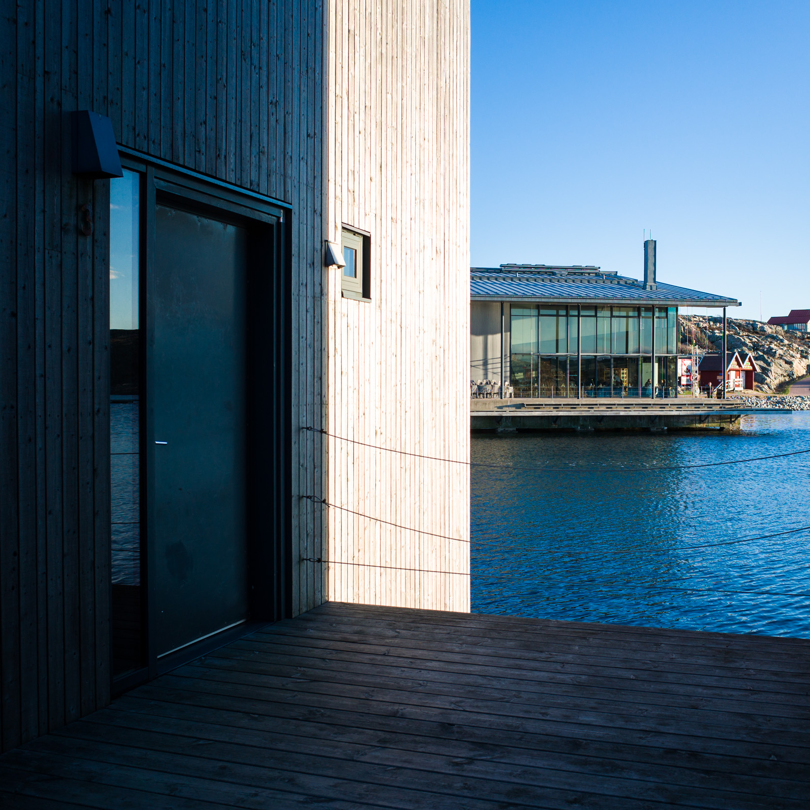
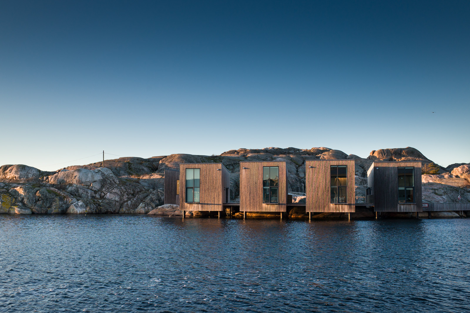
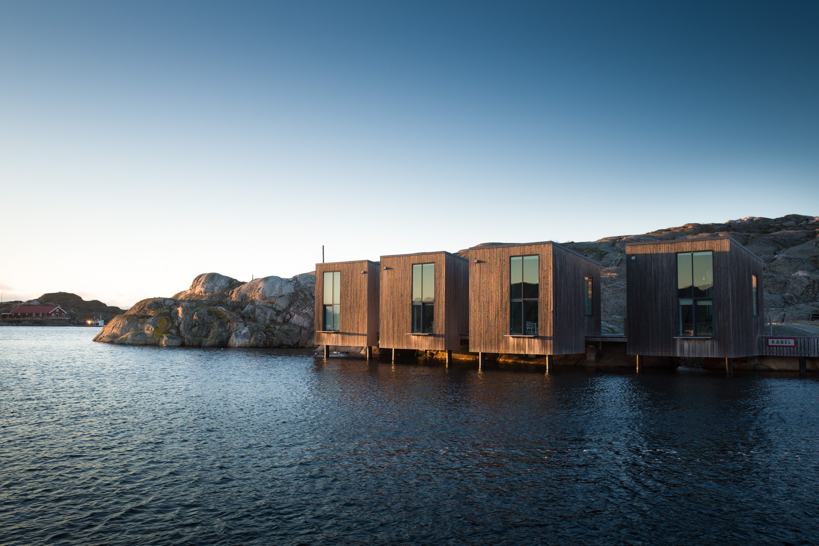
I'm starting the new year off with a rare architectural photography post. This is the Nordiska Akvarellmuseet, Nordic Watercolour museum, on the island of Tjörn north of Gothenburg, Sweden. 

The photos concentrate on the artist's studios which were designed by Niels Bruun & Henrik Corfitsen, arkitekter MAA in 2004.

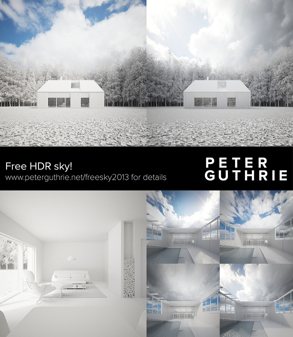
Free HDR Sky!

An early Christmas present for readers of this blog. You're welcome. :)

EDIT: It is no longer Christmas I'm afraid... If you want to try this sky, it will shortly be available in the shop at a discounted price (reprocessed & with backplates and scene file!)

free.jpg

Merry Christmas - God Jul!

(click for lightbox)

Wishing all readers of this blog a very Merry Christmas and a Happy New Year!

'God Jul' is Swedish for Merry Christmas and is also much easier to write when cutting down trees with a virtual chainsaw.

quick technical stuff: 3dsmax, vray 2.4, forest pro, fog in vray, lit by 1912, terrain from the free version of world machine and some smoke and silly things added in photoshop.

La Maison de Verre à la Bertrand Benoit

Bertrand's flair with materials and modeling seemed such a good fit with this architectural masterpiece that I had to put aside my own ambitions to do a visualisation study of it and see what he would come up with. Not disappointed! Really must find some time to do a personal project again!

This is just a small selection of images, have a look at Bertrand's blog for the full set, and if you are interested in the building, Ronen found a couple of nice videos about it.

(love this one as I've never seen photos of this stair, the timber floor material is very cool)